Co-founder at Sketch, pianist and photographer from the Hague, the Netherlands.

By day I do Product at Sketch. By night I play the piano, take photos, read and occasionally write. Also a bit of a history and architecture buff.
Driving a Carice TC2
It was seven years ago when I met the founders of Carice, who were developing a concept for a new kind of car; a classic design, lightweight construction, and an electric drivetrain.
It’s a concept that hooked me then, and it’s been an absolute privilege to see them develop this concept into a real car since that fateful day. Last week, another important milestone was crossed when I became the proud owner of the very first Carice TC2 that rolled off the factory floor.
This is not a review of that car – I couldn’t be impartial if I tried, it’s too dear to me. I’ve seen the car grow from sketches on paper to the first parts arriving at the factory. From the painful moments during covid lockdown when it was impossible to get supplies, to them powering through, with never ending dedication and patience, to them asking me to say a few words when they unveiled very first prototype model to a small audience of family and friends.
But I will say that the Carice TC2 is a beautiful car and it’s an absolute joy to drive. I could talk about its specs but that would be missing the point; just as a camera isn’t measured by its megapixels, or a computer by the speed of its CPU, the Carice is not designed to dazzle you with specs, but to put a smile on your face when you drive, and at that it succeeds in spades.
I don’t know how fast it goes from 0 to 100, but it also doesn’t matter; because it weighs only 590kg, because you sit close to the road, and because it feels like you have a very direct connection to the engine, the feeling is indescribable and it puts a permanent grin on my face. It’s not the specs that matter, it’s the experience, and that’s where it excels.
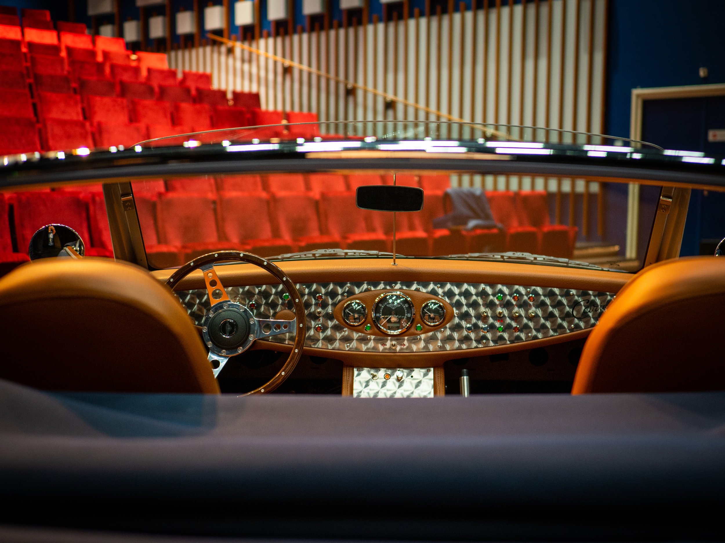
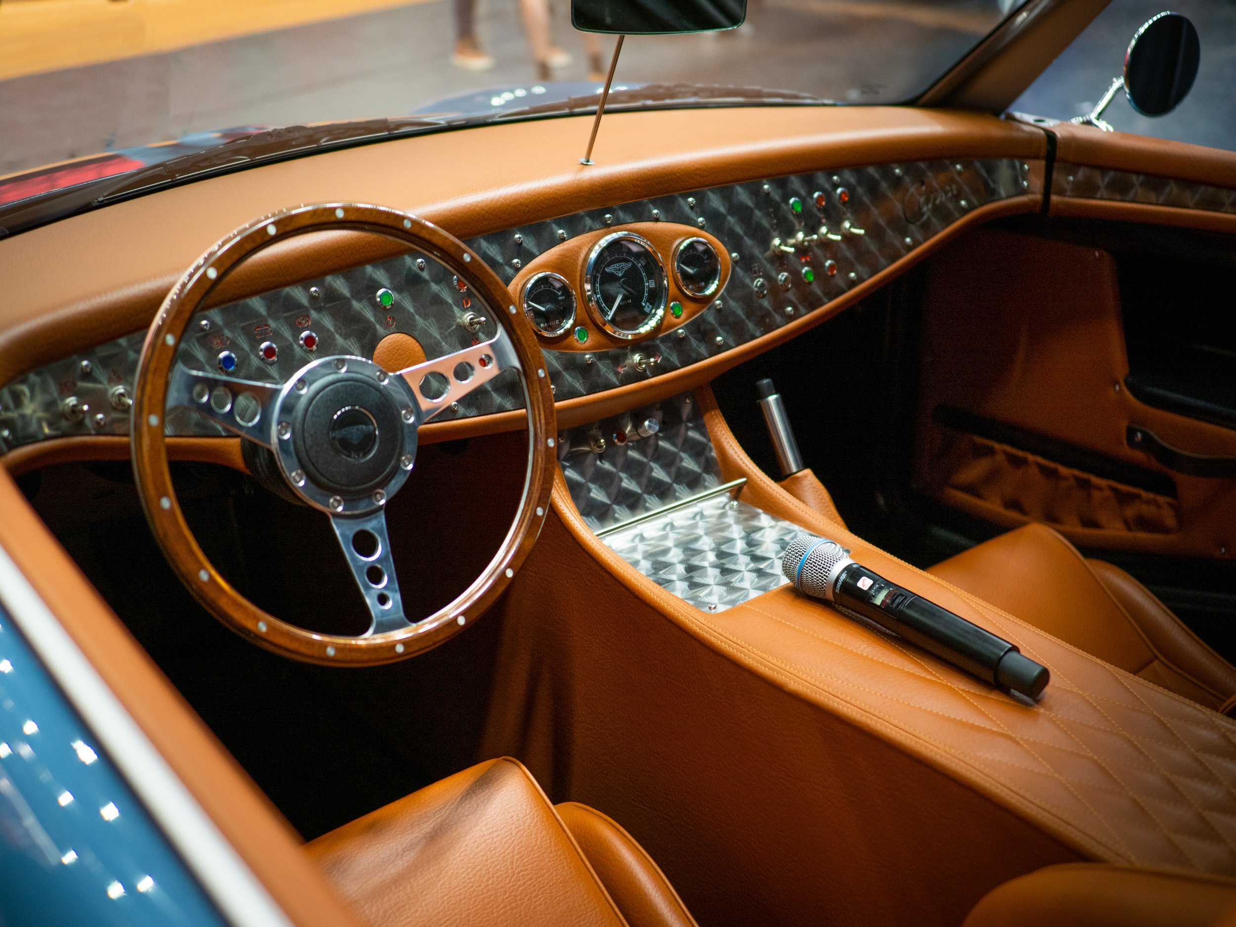
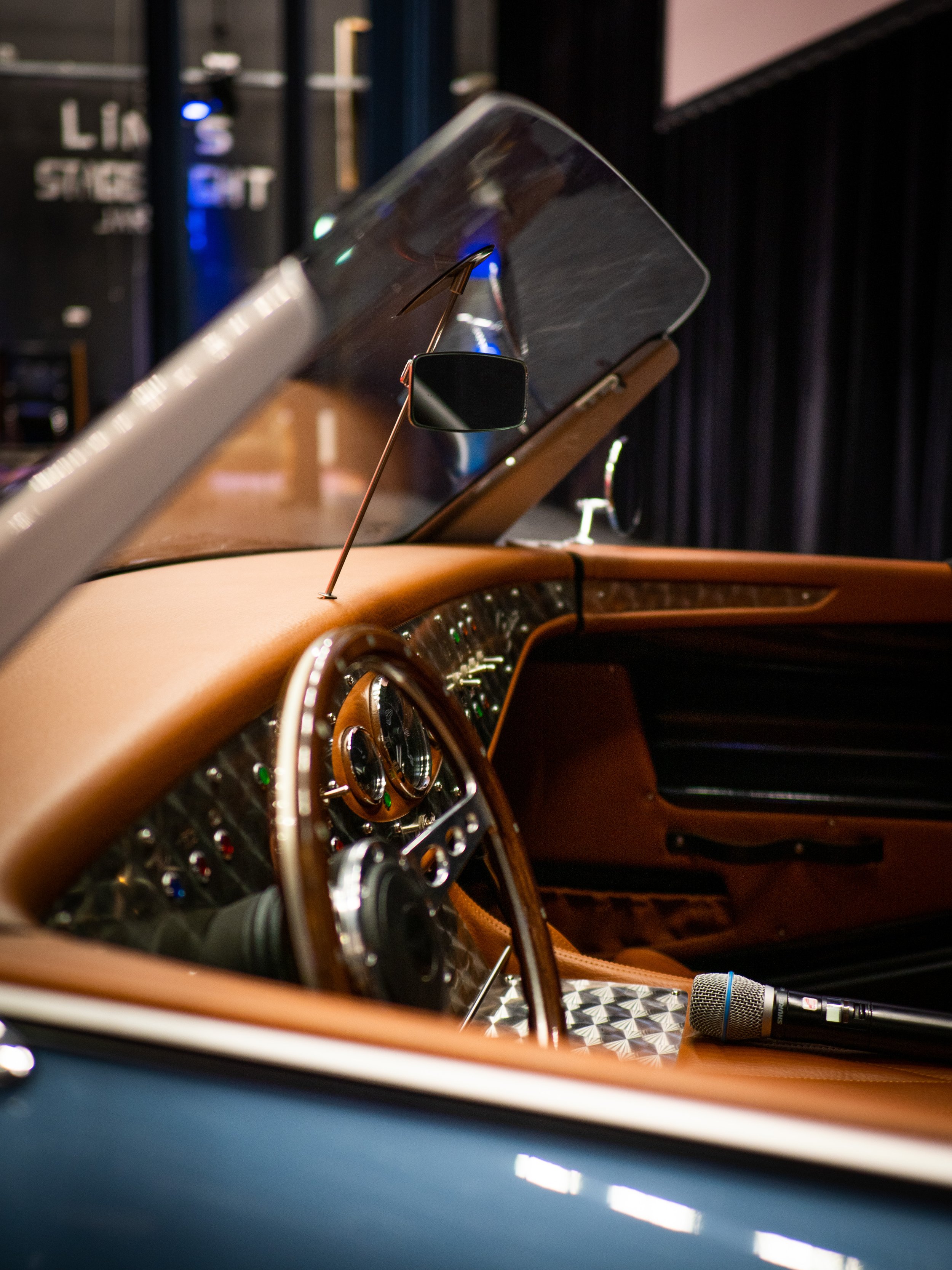
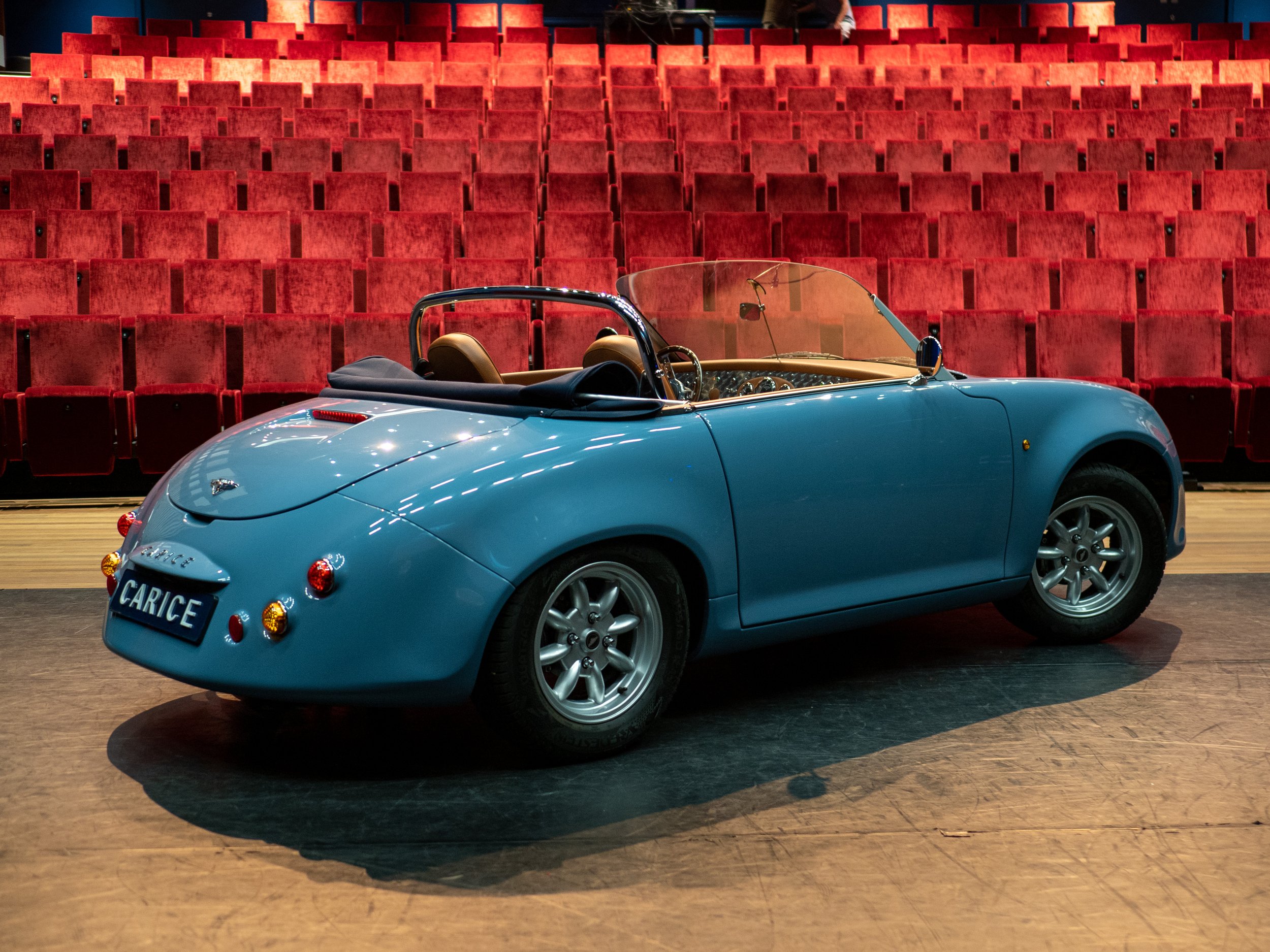
The car is also work of art. It’s modern on the inside, but an absolute classic on the outside. The bodywork is subtle and beautiful – I don’t have the words to describe it, so I’ll let the pictures speak for themselves. The cabin has a classic steering wheel and a beautifully polished dashboard with manual switches for everything. There’s design touches and details everywhere to delight the driver.
I knew I wanted to write about the car and take pictures to accompany it, so I drove to spot near to The Hague, where I live, to take some pictures emphasising the car’s origins. The Carice team are Dutch and are building their cars here in the Netherlands and so what could be more Dutch than windmills?
I’ll wrap up with a little practical note; you like what you see, get in touch with Carice where you can now reserve your spot now on next year’s production batch. Spaces limited.
Paris
I was lucky enough to spend a few days in Paris earlier recently, and of course I took a camera with me. For a short city trip like this I prefer to carry something small and pocketable with me, with a small set of lenses – which, as some would say, is the whole point of the Micro Four Thirds system.
I took my trusted Pen-F with me; it’s an older camera already but perfect for little trips like this; it’s compact, stylish and takes great pictures – and I have a great set of lenses for it.
I took just two lenses with me; the 25mm f1.8 and the 12-40mm f4 which are both delightfully small. I figured one for the general daylight shooting, and a faster prime for the evenings when the light drops. I’m very pleased with the results so I thought I’d share here.
Delicious Library
Come for the Hardware, stay for the Software.
This month Delicious Library, a hugely influential app for the Mac, for the indie developer community, and for my own story in particular, was finally shut down leading to many people sharing nice memories and reactions on what the Delicious Library meant, and I thought I should write a few words about it as well.
What drew me to the Mac initially was its industrial design. My uncle had an iMac G4, the floating screen, the swivelling arm – the one that looked like a lamp – and I thought it was a beautiful piece of art. What kept me on the Mac though was the software, the software from third party independent ‘indie’ developers.
These apps were made by small teams, individuals even, hand-crafted with a focus on the the beauty and the little details. They were dubbed by some the “delicious generation”, named after the forerunner of this trend, the aforementioned Delicious Library. When I finally saved up enough to get my own Mac I was hooked as well. I didn’t have enough books worth cataloguing in Delicious Library and I didn’t really have anything to outline in OmniOutliner, but I played with them endlessly but absorbed everything I could about them. Eventually I started dabbling in programming myself and from that point I knew what I wanted. I wanted to become an indie Mac developer and write apps like Delicious Library myself.
One day I remember reading about Delicious Library on what I think was Apple’s developer website, where they interviewed the developer, Wil Shipley, who talked about the App’s design, marketing and yes, how the app had made €250.000 dollar in its first month – a very large sum I thought, but more specifically; it was proof that this could be done and could be more than a hobby. I remember this because I showed this to my parents, who at the time were a bit skeptical of what what I wanted to do: you want to write software for this Mac platform that nobody uses? And sell it for a living? And sell it online? Who has a Mac again? Who buys software? Who buys anything online? (Remember this was ~20 years ago.)
But now I had proof that it was possible. That realisation, that it was possible to build apps like this for a living while also focussing on beautiful design, user experience and customer delight was what motivated me in my own way to start building apps. Making a living selling software online could be done, and Delicious Library had shown the way and provided the inspiration. First with Fontcase and then Sketch, both of which I’m proud to say have won an Apple design award as Mac-assed Mac apps. But it started there, 20 years ago with Delicious Library. And for that I will forever be incredibly grateful. So long, and thanks for all the inspiration.
Vision and Platforms
Disclaimer: I don’t have an Apple Vision Pro (full name™) yet. Not because don’t want one, but simply because I can’t order one. I live outside the US and likely need some sort of prescription to be able to comfortably use it. So instead I’ve been reading and watching my share of Vision Pro videos.
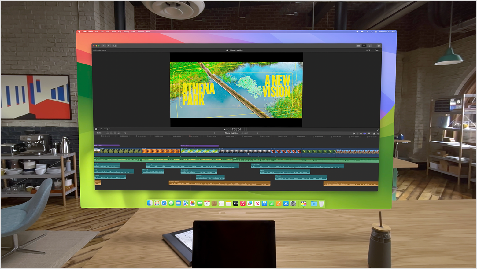
One thing stood out to me and that is how people talk about how amazing it is to project your MacBook’s screen into the Vision Pro. But is the very fact that you can do that not a great condemnation of Apple’s platform strategy? Why is it so great that you can project the screen from device A into device B? That should really only be an attractive proposition if the former lets you do things - run software – that the latter doesn’t.
The Apple Vision Pro has amazing displays, but its software ecosystem is apparently (and that’s not a surprise) not good enough. There’s a million iOS/iPad apps available on the Vision Pro (near) natively, where you can have multiple windows, arrange everything specially, yet what I keep hearing again is how great it is to project your Mac into the Vision, even if that projection is limited to single 4K display projected in front of you. Why is that so great?
I’ll tell you why: because people get real work done on Macs. Not on iPads, and that’s not going to change any time soon. I don’t think we need to look far to find out why that is. Apple’s iron fisted control over the platform via its App Store rules and review process keeps a very tight lid on it third-party innovaction. I’m reminded of how Facebook once billed itself as a platform, and Bill Gates called it “a crock of shit”:
This isn't a platform. A platform is when the economic value of everybody that uses it, exceeds the value of the company that creates it.
Not that this is any kind of official definition, but I think it embodies the spirit; who is the iPad platform primarily serving? It’s Apple. Nothing and nobody else comes close, and Apple wants to keep it that way.
Will the Vision Pro become a platform? I hope it will, but I have my doubts. Developers and Apple have long ceased to be friends – see Netflix, Youtube and Spotify snubbing the Vision Pro on launch. And going back to my original thought: why would anyone want to project their Mac screen into their Vision Pro? Because the Mac is a platform, always has been.
A new Pen-F camera
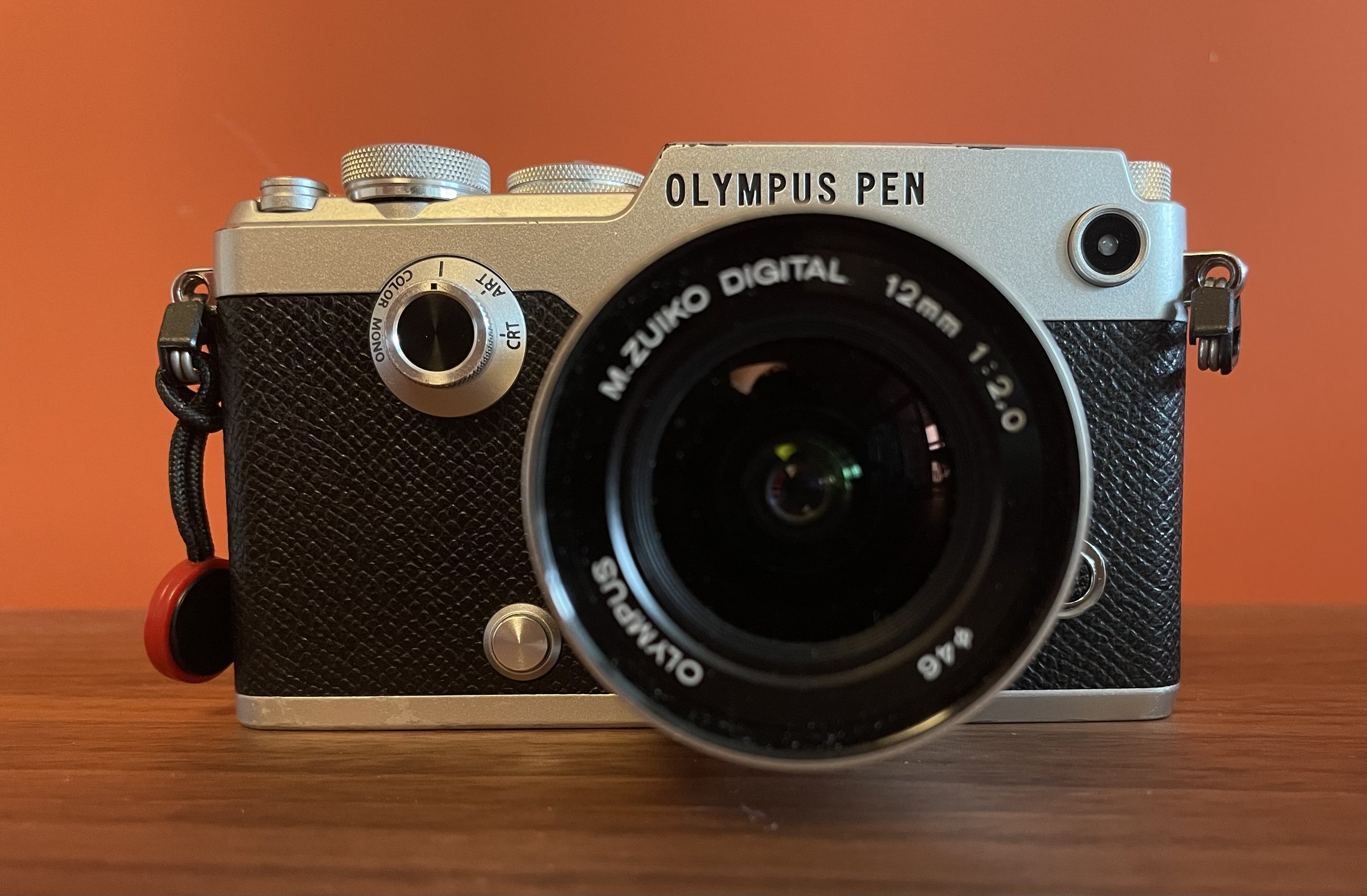
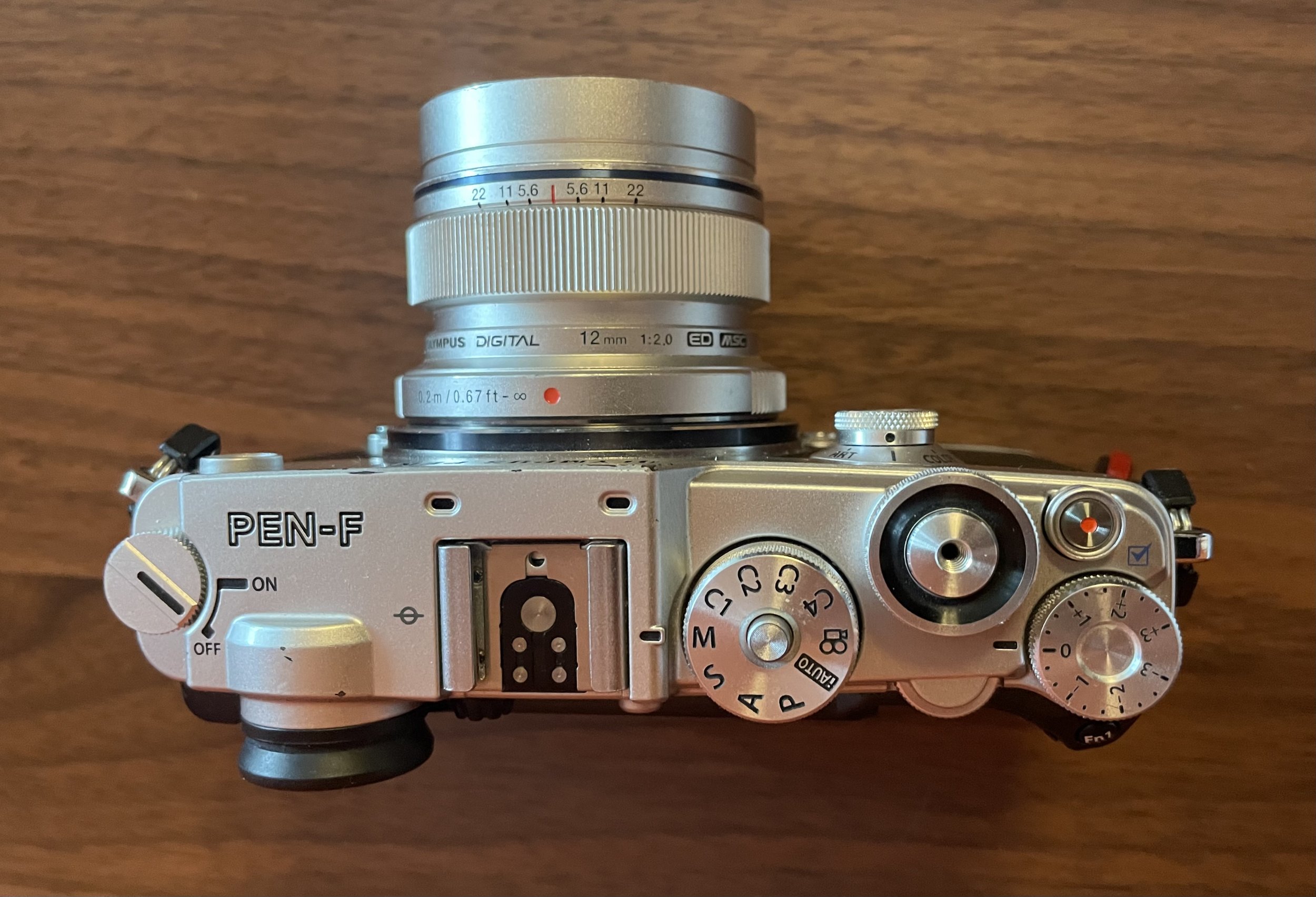
The Olympus Pen-F, originally released in 2016
The Olympus Pen-F is a small pocketable camera released in 2016 which, though I rarely use it anymore, I know I will never sell. Apparently it’s fan favourite too; its second hand price is higher than what’d expect for an 8 year old camera, and every time OM-System releases something, inevitable comments turns to “will they make a new Pen-F one day?”
Which is understandable. There are a few reasons why one might gravitate to a Micro-Four-Thirds camera, and without going into depth on sensor size and the benefits and drawbacks (I’ll save that for a follow-up); size is definitely one valid reason for choosing the M43 camera system.
The Pen-F was a great small camera: excellent hardware; interchangeable lenses, it slides into any pocket and its just feels great in the hand. The dials are beautifully tactile; the Aperture dial is lovely and turns with exactly the right amount of effort, the exposure compensation dial is harder to dial, but that’s the exact point. While I would drop some dials – more on that later – they are all really well done.
Another favourite of mine is its flip-out tilting screen, and I much prefer it to a screen that only tilts. I love shooting in portrait mode closer to the ground and try slightly unusual perspectives, and these flip-out screens are perfect for that.
The tilting screen allows for ultimate flexibility in camera angles.
Practical in landscape orientation, but in portrait they’re of no help.
The Pen-F also has great image stabilisation, I can easily hand-hold a long exposure and take pictures at low light, it’s impressive. It has great autofocus, white balance, color reproduction and all that. In short, it was a great camera when it was released.
Making a better Pen-F
However, it’s 8 years old now, so, if OM-System were to release a new Pen camera, what should they change, add, improve? Here are a few things I would love to see. I’ve got 5 obvious ones and three perhaps surprising ones. Let’s start with the obvious ones:
Updated sensor & processor. This is the obvious one of course just take the same ones that are in the OM-1. Yes, this would keep the camera at 20MP and that’s totally fine, stick a small zoom lens on it or take an extra tiny prime lenses with you and you never need to crop really. OM-System’s range of f1.8 prime lenses are great.
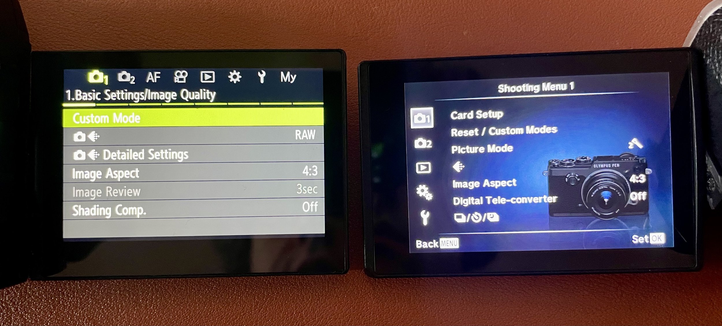
A new menu system. The OM-1 shipped with a great new menu system, and the newer OM-5 for inexplicable reasons stuck to the old menu system. One looks modern, works great and the other one looks distinctly year 2000-ish and has an inscrutable menu structure.
USB-C charging. I should be able to charge the camera with a USB-C cable, the same cable I can use to charge my laptop, my phone, my tablet and everything. For something pocketable, travel-ready, I think it’s a must. My OM-1 does, and once again for inexplicable reasons, the OM-5 does not.
Weather sealing. This was the main thing people held against the original Pen-F and rightly so. Fortunately OM System excels at weather sealing so I don’t doubt it’ll make its way to a new version.
Upgrade the display and EVF. I’m not exactly sure what pixel density and refresh rate it uses but I know that my 8 years never OM-1 has a superb EVF which the moment I looked through it I knew I wanted that camera. That is honestly the first thing I noticed that immediately convinced me I wanted to upgrade.
New menu system left, on the right the old one. Of note are the gradients, and the picture of the camera to remind you what you’re holding. On the left though I’d argue we don’t need those grey boxes, but I’ll write about that another time.
Off the beaten track
The above improvements would all make sense I think and should be in no way contentious. They’re also not really worth writing about – itt’s been 8 years, bring the hardware up to 2024 levels. It would only be surprising OM system they didn’t make these changes!
I do have also three possibly less obvious requests though:
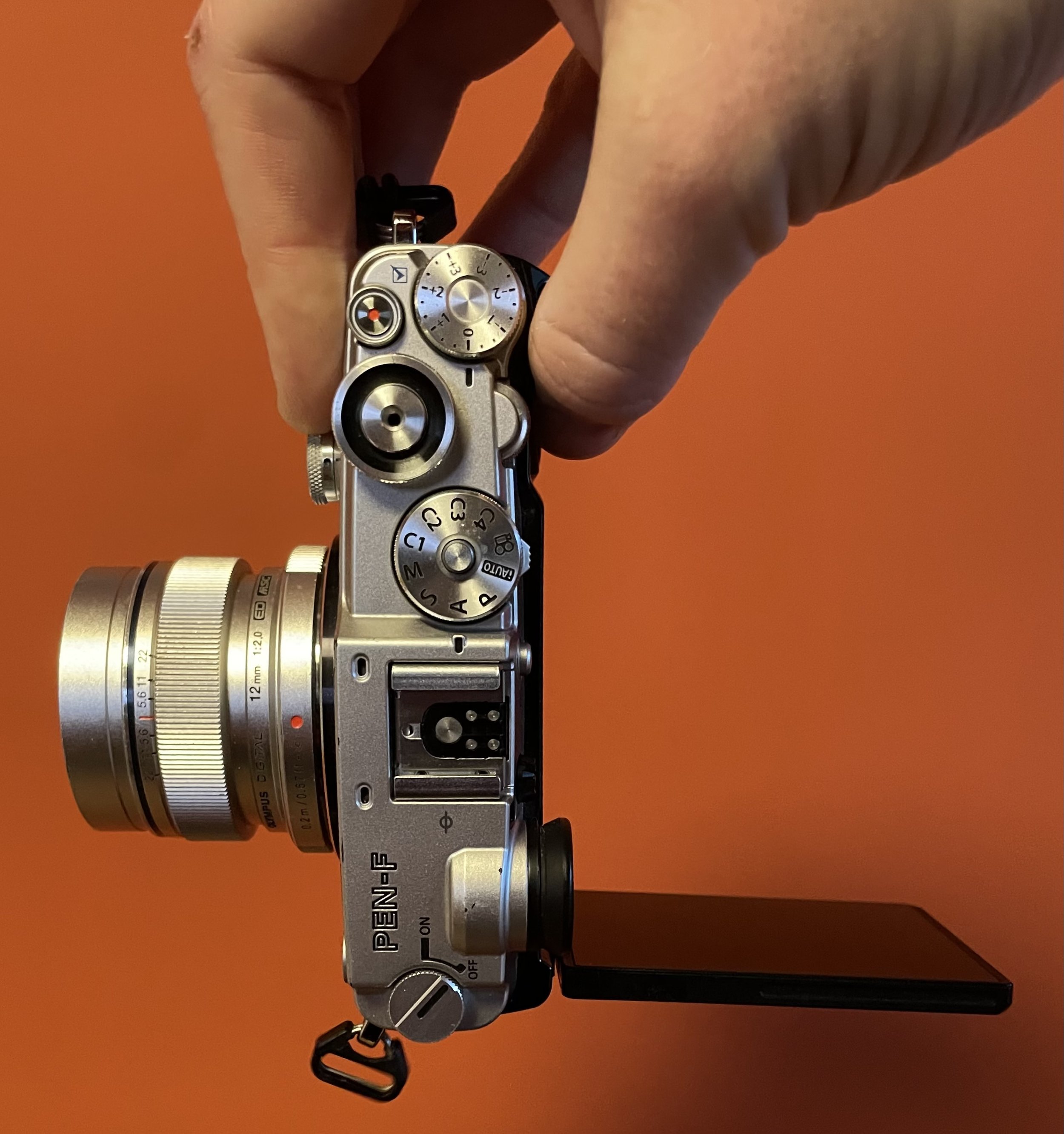
Simplify the hardware; I want fewer dials! The Pen-F is a beautiful camera but it has too many buttons and dials. There are 4 dials on top and one on the front; the classic P/A/S/M dial, aperture front dial, a back dial (shutter speed in some modes), a special exposure compensation dial (which only works in some modes) and an “art” dial on the front – more about that later. At a fundamental level though, I never felt like I really understood my camera: the menu system and overload of buttons and dials that did different things in different modes is just too much for an amateur photographer. The Pen-F was never meant to be a professional’s camera anyway; I don’t think we need three extra programmable FN buttons?
Buttons: While early on I raved about the quality of the dials on top of the camera, the buttons on the back of the camera feel distinctly cheaper, almost as if the top and front of the camera were designed by different teams than the back. I’d love to see those buttons improved and feel more tactile.
Ditch the Art dial. A rare as it is to argue for fewer features, I would argue that case here. The Art dial on the front of the camera leads you into a very finicky and hard to learn UI for choosing different art effects – and gradations in those – that get baked into your JPG files. Camera makers are generally not great at making good user interfaces, and I can hold this entire section up as a prime example of that. I think the camera is better off without it. We all know how to edit images on our phones; focus on getting the pictures off the camera as fast as possible instead. While the promise of the ‘fun’ Art filters could be considered interesting, if you can’t find your way around, it only makes the experience worse; nobody likes to be made to feel stupid.
That’s a lot of dials – too many if you ask me.
I’m really hoping there will be a refreshed Pen-F camera. While OM-System after the rebrand/relaunch focussed (probably justly) on the nature and wildlife photographers, I hope they’ll try their hand again at the Pen-F, I’m sure they could do an amazing job.
Photographing Wildlife
A couple of weeks ago I went on a wildlife photography holiday in Andalucia, Spain. It was the first dedicated and organised photography trip I ever went on, and I had no idea if it’d be something for me. I like photographing birds and other animals but I had never sat in a hide before for hours and I wondered; would I be bored stiff?
Well, if the wildlife wasn’t for me, I would still be in Andalucia, a region I visited before and absolutely loved, so I figured it was worth the risk. Also since this was my first such trip and didn’t really know whether I’d be there for the animals or the landscape in the end, I had a hard time deciding what lenses to take. In the end, unsurprisingly I decided to basically take the whole bunch. “Madre Mia” exclaimed the lady at Malaga airport when I and a fellow photographer had to take out our lenses for the security scanners on the way back.
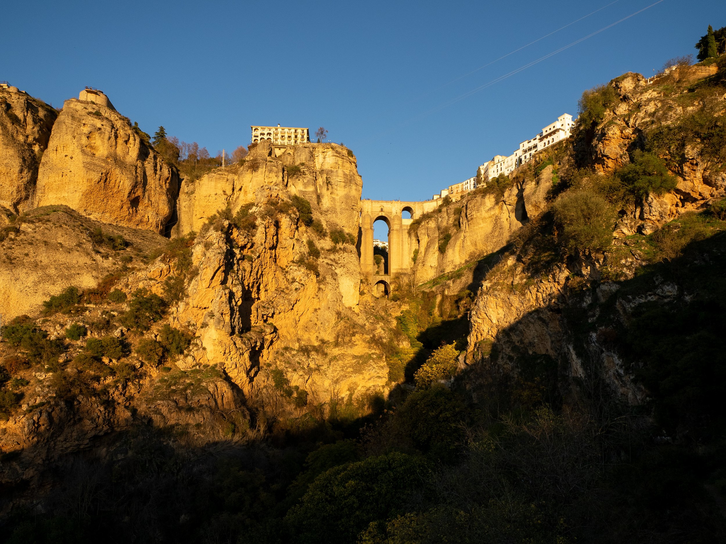
The trip was organised by Espen Helland, who I know from his YouTube channel, and his excellent OM System for Wildlife Photography course, and Álvaro Peral who runs Wild Andalucia. We were based out of Ronda – known for its famous chasm-spanning bridge and apparently a story by Ernest Hemingway about the town leaders being thrown off said bridge – and explored the area around for a week as far as Gibraltar.
This holiday I had planned for myself featured a progression of increasingly early rises, so that when, by the end of it, we were expected out only at 6:30AM it felt like I had a proper lie-in. It was worth it though; we wanted to arrive at the places Espen and Álvaro had selected before sunrise, and that required some sacrifices.
The first time we woke up early – 6am I think – it was to see vultures glide in the early morning across the mountain cliffs – a majestic sight which I wasn’t able to capture in a decent way on my camera not having my settings quite right. One of the benefits of going on a photography trip is to learn from the organisers, and I did a ton as the week progressed. However, for the vultures in flight I’ll have to come back another time.
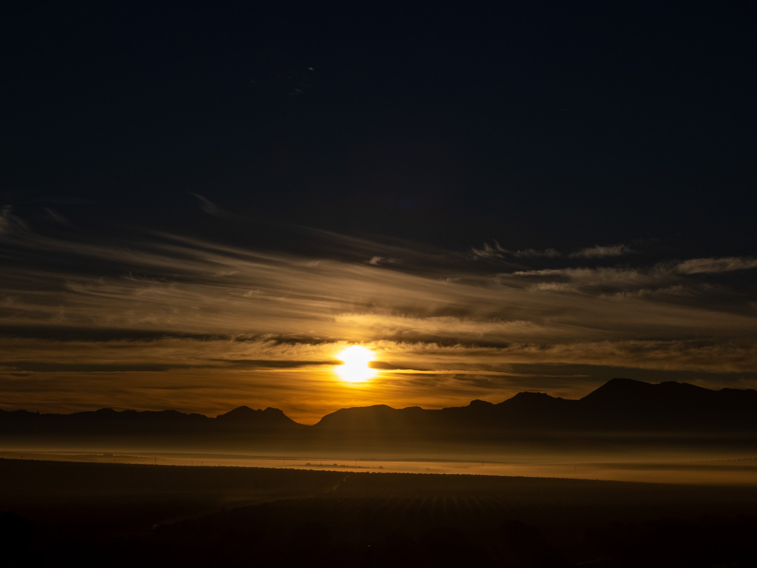
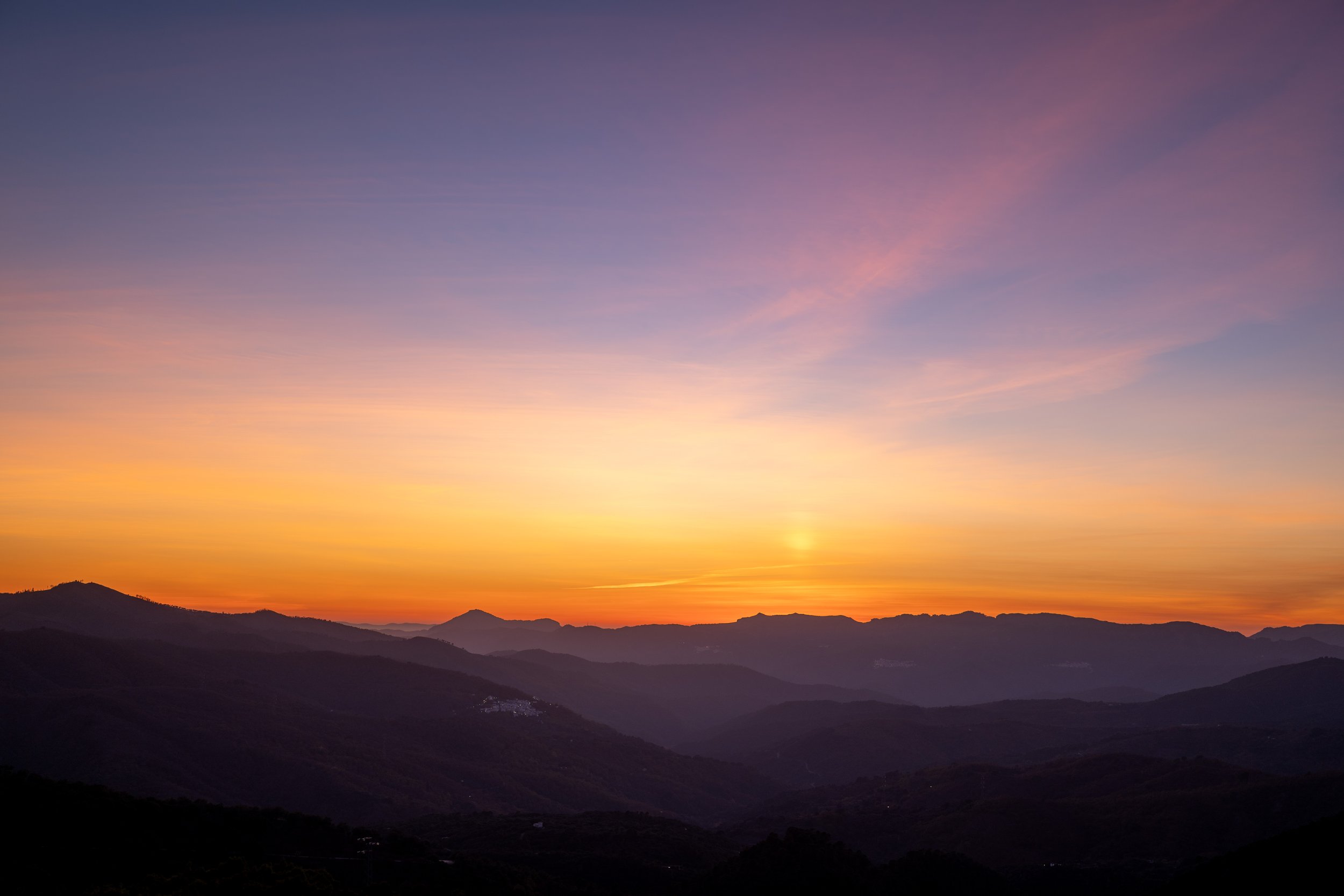
The second morning we got up earlier – I think it was 5am – to photograph cranes as they passed in front of what we hoped would be a beautiful sunrise. The chosen setting, the sunrise, proved indeed to be a beautiful one and I happily shot way too many pictures as the darkness and mist slowly gave way to a fiery red sky and beautiful blue and golden colors. The cranes however were nowhere to be seen so while the shot we were hoping for eluded us, we had a magical morning nonetheless.
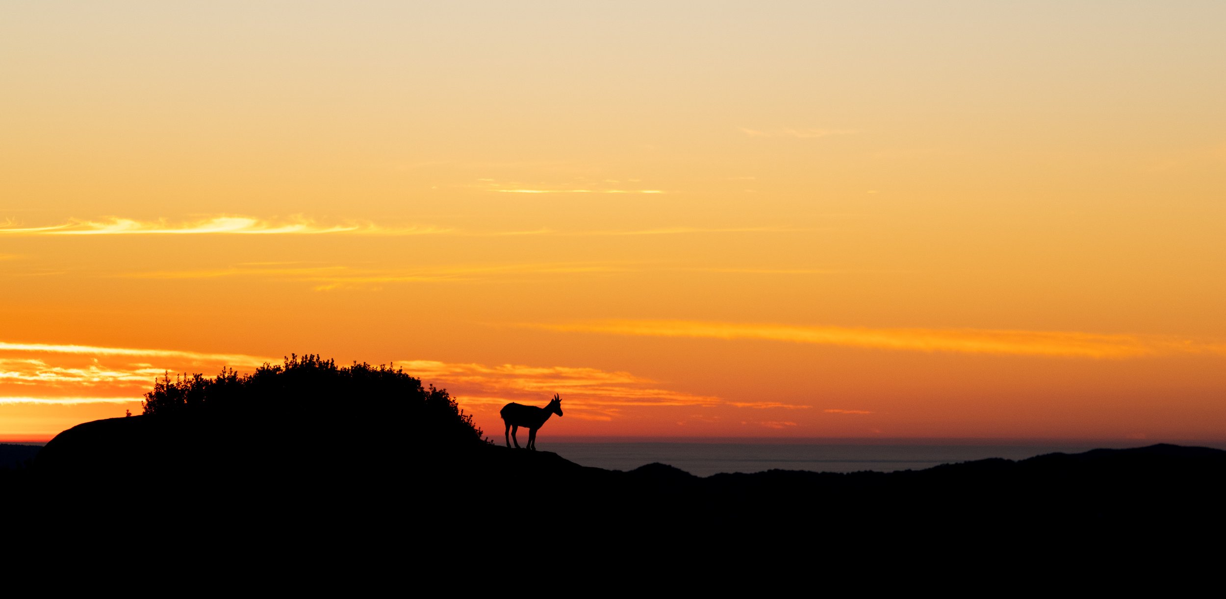
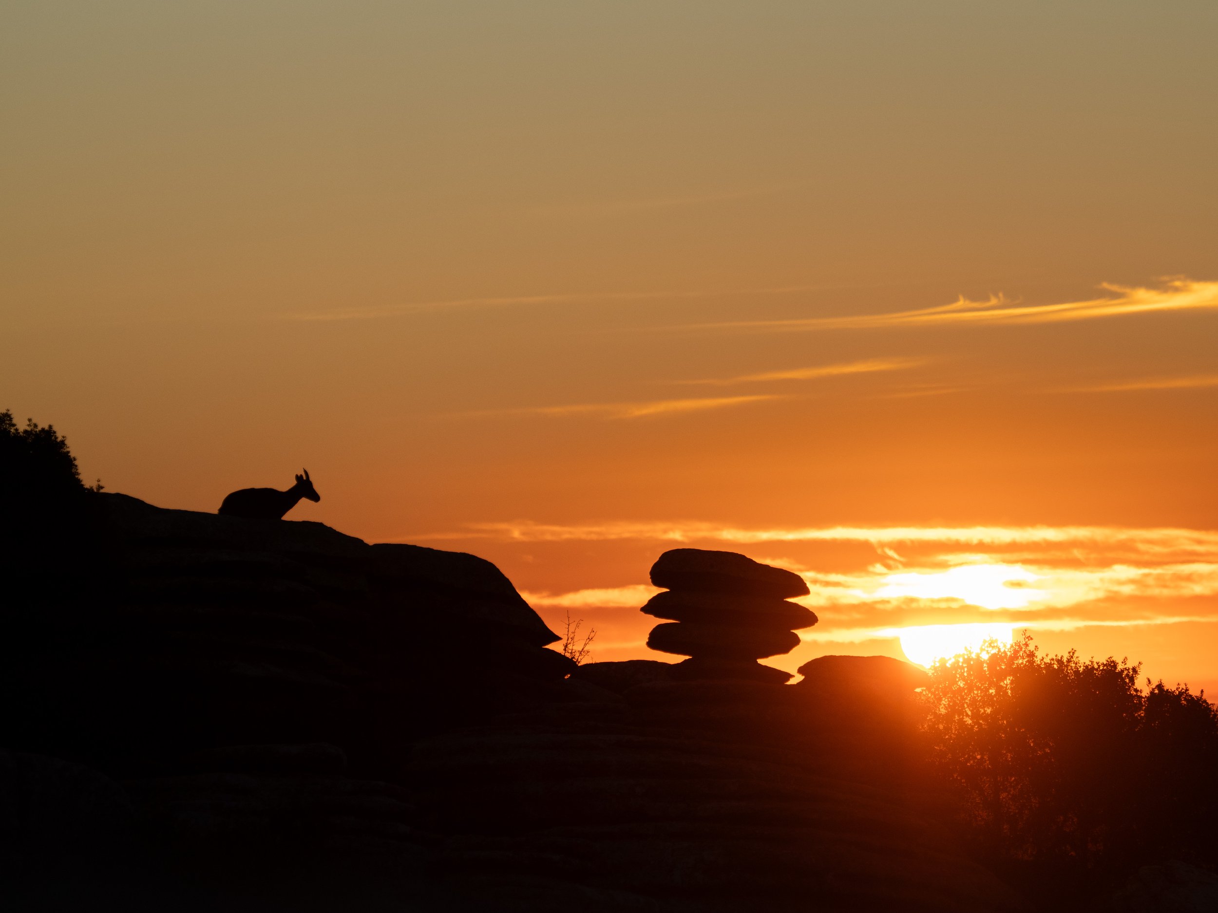
The third morning we got up even earlier, shortly after 4am, to head to El Torcal before sunrise to photograph the Iberian Ibex in the absolutely stunning setting there. Fun anecdote; it’s the area in Spain where most emergency calls are made from; one gets easily lost in the maze of rocks and having been there, I can understand it. We arrived there just in time and this time the animals obliged, and we got a few shots of an Ibex perched majestically on a rock as it calmly awaited the sunrise, a magical sight.
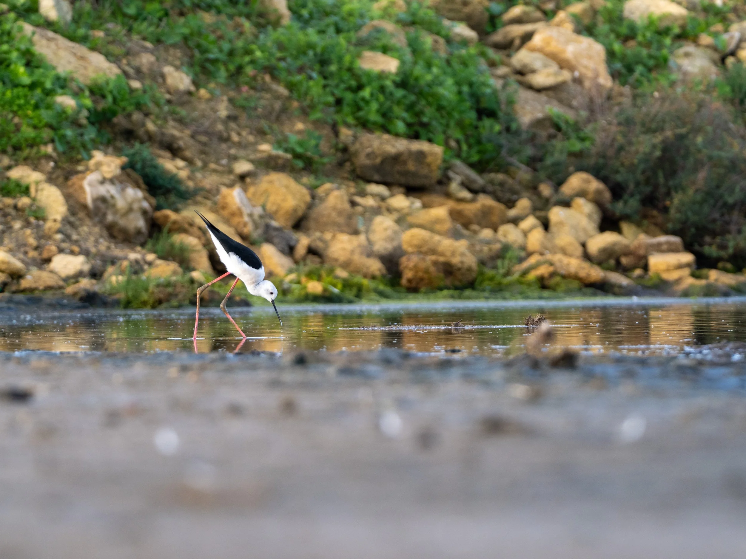
The fourth morning we woke up at the same time again to head to a wetland near Gibraltar to photograph wading birds at dawn, with a stop for butterflies on the way to Gibraltar for the only spot in Europe where monkeys live in the wild. Now I have to say that “in the wild” is a bit of a misnomer; you take the cable car up to the top of the Gibraltar rock and the monkeys welcome you as the lift opens, looking for a snack – it’s by far the closest I got this week to feeling I was photographing animals in a zoo, and that’s not a feeling you’re looking for.
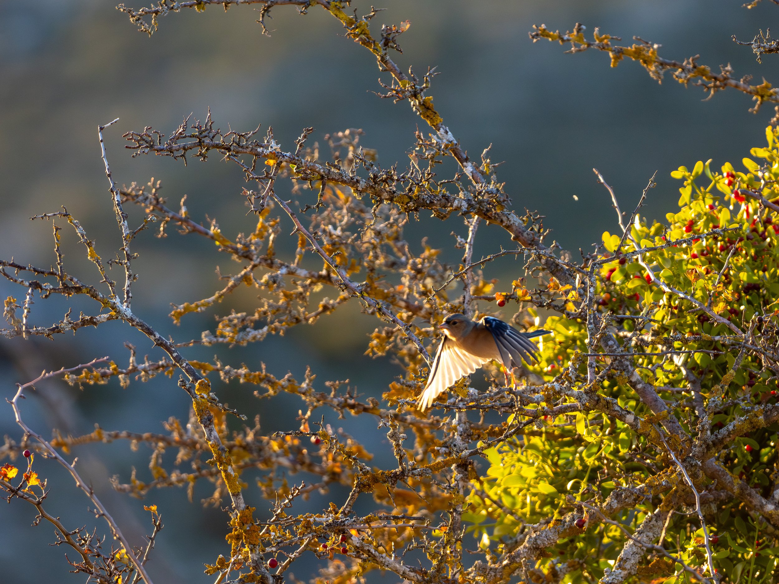
The last morning we started near Ronda, at one of Álvaro’s hides, to photograph birds as we sat hidden under camouflage, practising photographing birds in flight. We’d been to this spot earlier in the week to photograph them at sunset, but this was the bit I was most unsure about; four hours of sitting there, photographing birds, but I absolutely loved it. Having tuned my camera settings and dials throughout the week, I was ready for this. I may not have caught any vulture sharp, but these fast little birds were not going to escape me. I shot an entire memory card full of these birds, bringing my week total close to 10.000 photos taken, and I was pleased afterwards to see that I had gotten many of them sharp.
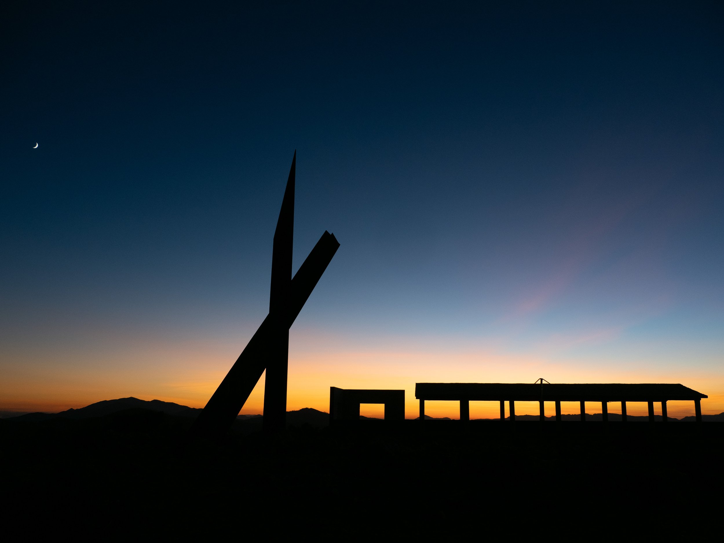
The last evening Álvaro took us to a spot where we could admire the sunset, and that we did. The sun going down over a valley with a village lying there halfway in the distance, it was a magical sight. Behind us, someone had tried to build something, but had evidently not gotten their planning permissions right, and the silhouette of the abandoned structure proved to a great foreground once they sun had gone down and the sky had turned its signature blue/orange. A small moon perched in the corner made the image complete. What a great way to end the week, I thought.
And then it was Saturday already, Álvaro drove us back to Malaga airport, with a surprise stop on the way to photograph some burrowing spiders, which is where my 60mm macro lens came in handy for the first time this week. The built-in focus stacking in the OM-1 came in handy here and we had a fun time photographing these truly bizarre creatures.
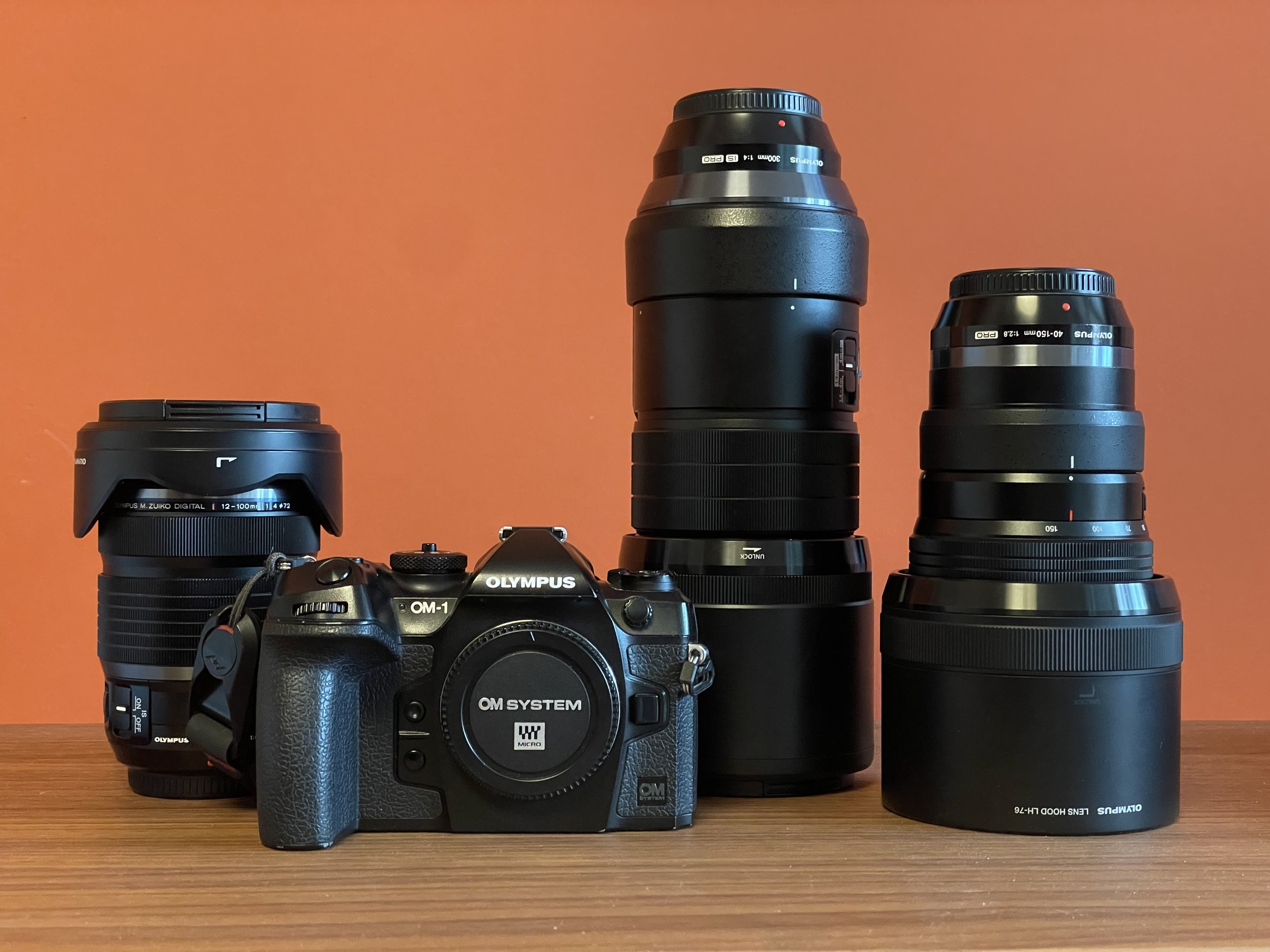
Now I don’t want to end the post with these pictures (apologies if you don’t like spiders!), so I thought I’d talk a bit about my gear. I had a big camera bag in the back of the van with all the lenses I took, but the majority of the time I shot with the OM System’s OM-1, and two lenses: the 40-150mm f2.8 and the 300mm f4. The former for the larger animals and the latter for the little birds. The big camera backpack stayed in the van and most of the time I walked around with the Peak Design 10L sling, which is a great bag that fits those lenses, the body and has room for one more; which was alternately taken up by a bottle of water, or the 12-100mm f4 or 8-25mm f4 for my on-location landscape shots. (The 12-100mm f4 really is my “you get to take one lens, which one is it?” choice.)
As said, the majority of the birds were shot on the 300mm f4. It’s an absolute beauty of a lens, tack sharp, fast and still portable. It also just feels like a great lens, the metal body construction, the focus ring, the hood, everything is just great on this lens. Much much better to me than the 100-400mm f5-6.3, which somehow feels a bit cheap to me. I know it may feel silly, but I love good, well-designed gear. The 300mm passes it with flying colors, and at the long end its a full two stops faster than the 100-400 – not unimportant! It’s also surprising how little difference there is between 300mm and 400mm; nothing a little post-edit crop can’t resolve. It’d trade it for 2 stops of light any day.
The second lens I used a lot was the 40-15mm f2.8. It’s another in OM-System’s Pro lens line-up and it’s just a beautiful piece of kit. I’ve read that if there’s one lens that you show to make people understand why M4/3 is a great idea; it’s this lens and I can understand it. It’s relatively small, has internal zoom, and its range is impressive.
These two together are probably all you need for wildlife photography, together with the 1.4x teleconverter you basically cover the range from 40 (80mm full-frame equivalent) to 420mm (840mm), and it all fits in a small 10L sling bag, with room for more.
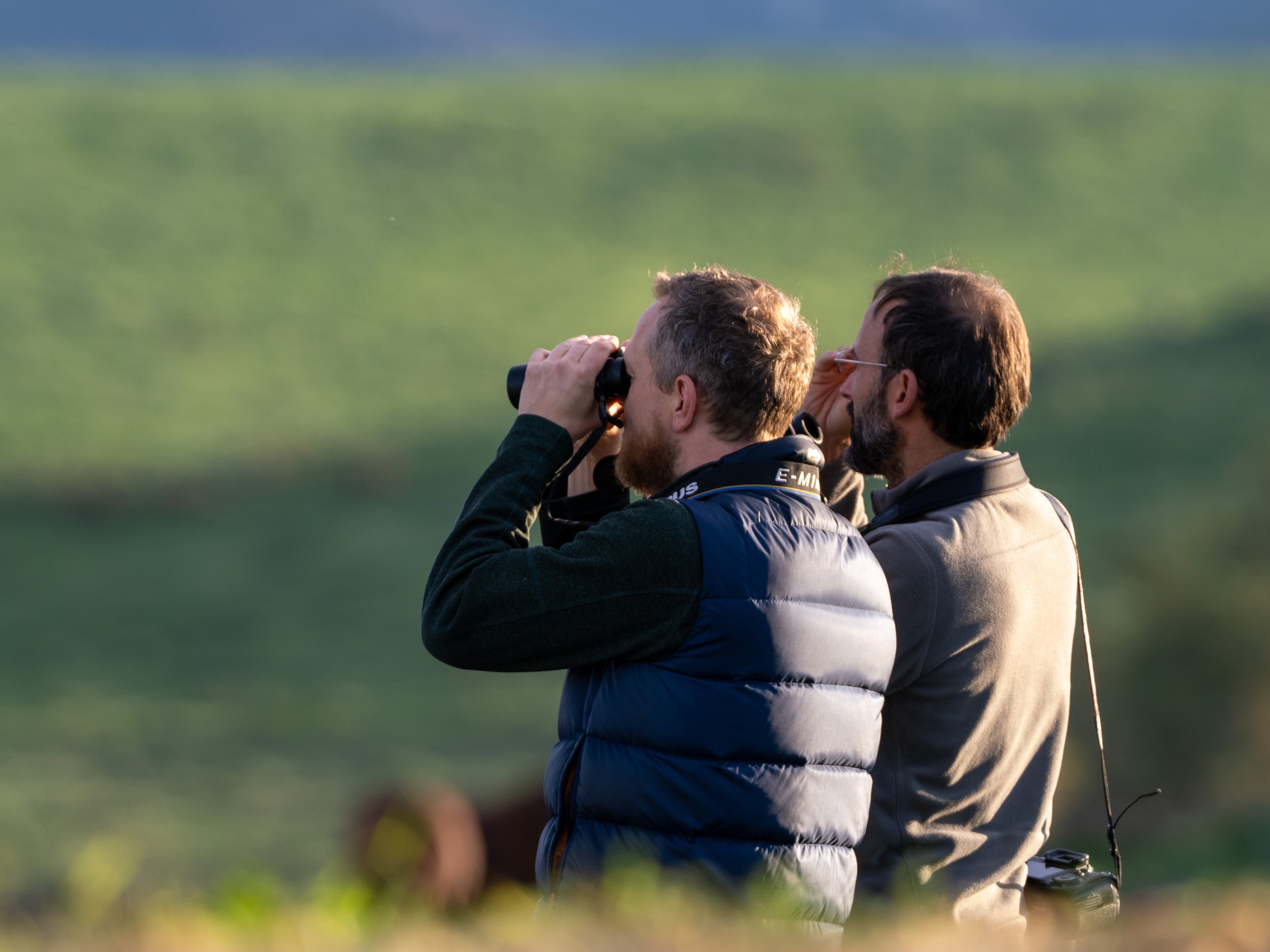
In short, I had a blast of a time, with two great guides. Their knowledge of wildlife is impressive, Espen’s knowledge of how to best shoot wildlife, especially on OM system cameras was great, and Álvaro’s boundless energy, enthusiasm, incredible punctuality and hours and hours of driving out in the dark before dawn and back in the evening after sunset was much appreciated. I understand they’re thinking of organising a similar trip again next year and can definitely recommend the experience. I’ll close off with a few more pictures, so the the image I leave you with is not of a scary little spider:
Glorious sunsets
Sunsets at the seaside here in The Hague can be absolutely brilliant. Only minimal editing here.
Unveiling a Car
It's the evening of June 6th, and we're at a small coastal town in the Netherlands; Noordwijk. The scene is theatre "de Muze" and the room is packed. We've all come here for what is rather a special occasion; the unveiling of a completely new car.
The final minutes before the start of the show, co-founders Niels van Dril (L) and Richard Holleman.
For me the story started 6 years before that, when I made a test drive on a new part of the Delft campus in a small convertible that gave me a driving sensation I hadn't felt before. The car had been built by Carice, a small startup out of the university and I was hooked by their passion and enthusiasm for this concept; a lightweight, electric car with a beautiful classic design. I made a small investment and pre-ordered a car of their new series. It would be an improvement on the original in every regard, from design, to finishings to range. In software terms, a worthy 2.0.
We visited the team over the years, as the work progressed, challenges were overcome and a factory began to take shape, tucked away in the flower fields of Holland. Fast-forward past a pandemic, a lockdown and component shortages, and we arrive at the long-awaited unveiling of something truly unique, willed into this world by their never-ending optimism that this day would come.
And the day came. The theatre was packed, the car hidden under a large black sheet in the corner of the stage, ready for the reveal later on. They had done me the honour of asking me to open the evening, recounting how we met, the ideas that fuelled the creation of this car, their passion for building something at sustainable pace and do so in-house with their own hands. Having said my bit, they proceeded to recount the origins of their collaboration, the structural backbone design that houses the batteries and how the final exterior design took shape. They ended the evening with a dramatic reveal of the car which rode onto the stage away from under the big sheet to thunderous applause.*
Having built up the suspense, the car’s ready to be revealed. In the background one of the first prototype cars which also made a special appearance during the show.
After my opening I had to wait backstage until the show was over, but I had my camera** with me and tried to make the most of the awkward angle and the harsh purple stage light – hence the monochrome. I'm quite pleased with how the photos came out in the end though.
Over these years we had become friends, and so I may be biased when I say this, but the Carice TC2 they revealed is one of an elegance, beauty and style that surpassed all my expectations. I’m super proud to have played a small part in making this car a reality.
As much as I love what I do for a living, software is inherently intangible; servers need to be kept online, and how long does it really take for software to stop working as the pace of hardware inexorably marches forward? What they’re making here though is real, as real as the factory its made in, as real as the warehouse where all the required parts are stacked up high. Every time I’ve been able to pay them a visit it’s been a step into another world. A world with the harsh limits of physics, the harsh realities of supply chain shortages, but when the Carice TC2 drove out on stage it told us all it had been worth it. Maybe it will ride in a rally 40 years from now; a piece of art that can still be seen, admired and driven for a long time to come.
It’s not just a beautiful object, there’s a purpose to it design that appeals. Thanks to its lightweight design it can go over 300km on a battery of only 31kWH and due to its low centre of gravity, with the weight of all the batteries centred in its backbone, it makes for an incredibly fun and dynamic drive. If all goes well I'll be taking delivery of my Carice TC2 later this year – and I can’t wait – where I plan to take it out for a spin and share my experiences here.
Before the show started and the car had disappeared under the sheet I was able to shoot a few pictures of the car under more forgiving lighting circumstances, so if you’re curious, take a look at the gallery below. For my European readers, the Carice TC2 is now available for pre-order at caricecars.com. The first batch is sold out but they will undoubtedly make more.
* Special shout-out here to the unfortunate Tommy who'd been hiding in the car under the black sheet and hot stage lights there the entire show until it was time to ride onto the stage.
** All pictures taken with OM-1 and the 20mm F1.4 or the 12-100mm F4 lenses. At some point I’ll write a blog post singing the praises of this incredibly versatile 12-100mm F4 lens.
Zooming in Paris
Over the years I collected a number of nice Micro Four-Thirds lenses (m4/3 for short). My collection consists of a 12mm, a 20mm, a 45mm and a 75mm – all great little Olympus prime lenses with low apertures that pair nicely with my Pen F (also Olympus). While I know prime lenses are superior optically to zoom lenses, the constant changing of lenses was getting to me. Many years ago I bought an entry level DSLR, an Olympus e500, that came with two kit zoom lenses and I realised I wanted to get back to that.
The quest for a zoom lens
The question though was; which one(s)? There’s wide variety of great zoom lenses for m4/3, (an embarrassment of riches really), that made choosing one hard, even more so considering the fact I hadn’t really settled on what range I really wanted.
A quick note on m4/3; if you want to compare focal ranges with standard full frame cameras, multiply by two. As an example a standard 50mm range, one would take a 25mm m4/3 lens. The 2x magnification factor is due to the smaller sensor size.
One thing I did know about focal lengths was that I’m using my 12mm prime a lot, I’m definitely leaning more to wide angle shots for landscape and architecture than close ups for portraits, so 12mm (24mm equivalent) had to be included in the range.
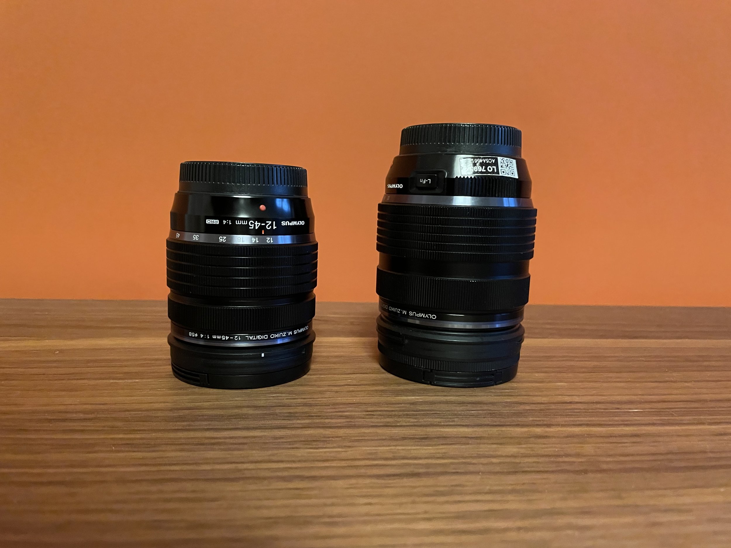
Olympus (now OM System) has a great pro kit zoom lens at 12-40mm f2.8. it includes that 12mm focal range I wanted, and 40mm is a good zoom length – remember that’s a 90mm equivalent. They also have a 12-45mm f4, which due to its bigger F number means less shadow depth of field and worse low-light performance, but that results in a significantly smaller lens. For comparison:
Size comparison: 12-45mm f4, 254gr, on the left, 12-40mm f2.8, 382gr, on the right. Picture may not do reality justice, it really is significantly more compact.
OM Systems also has a 12-100mm f4 – an impressive zoom range. As an added bonus it has image stabilisation in the lens which amplifies the stabilisation already in an OM body so the combination is an especially great one. My hesitation with this and the 12-45mm were their f4 apertures. The ability to go lower is better in general, especially in low light, but also leads to shallower depth of field which in landscape/architecture photography isn’t all that useful, and lower f-stops mean bigger and heavier lenses. Is that worth it for me?
My last question was whether 12mm was wide enough for me. I like that angle for a lot of my photography, but would going wider be useful? I’ve never tried. What options do I have there? Panasonic has 10-25mm f1.7, which is quite heavy though. OM Systems also has a 9-18mm f4-f5. It’s a bit of an ugly lens, call me a snob, but also compact, so that’s good. Olympus also has a 7-14mm f2.8 pro and a 8-25mm f4. The latter interested me most here for it’s a useful range, but again it comes with f4.
So what was one to do given all these questions? I decided to look at Rentals. I had a trip to Paris coming up which I thought would be the ideal excuse to rent a few lenses and see what I’d like shooting with.
The best way to get to Paris is by Train of course.
Fortunately locally in The Hague I could get some of the lenses I was interested in rented:
Olympus 12-100mm f4 pro
Olympus 12-40mm, f2.8 pro
Olympus 7-14mm, f2.8 pro
Lastly, for good measure, I also rented the new OM-1 body because my Pen F is 6 years old already and I wanted to see what had changed since.
Having picked all that up, I was fist of all struck by, well, the size of these lenses. They were bigger and also heavier than I expected, despite having watched every YouTube video on the topic I could find beforehand. My original plan to take these three new lenses, my old body and maybe a prime or two for doing full comprehensive comparisons went overboard; my camera bag (Peak design 6L) was too small and I would need two more bags too carry it all. I wasn’t going to do that.
Left to right; 12-100mm, 7-14mm, 12-40mm with my existing 75mm prime and 12mm prime next to it for comparison. Yes, zoom lenses are bigger!
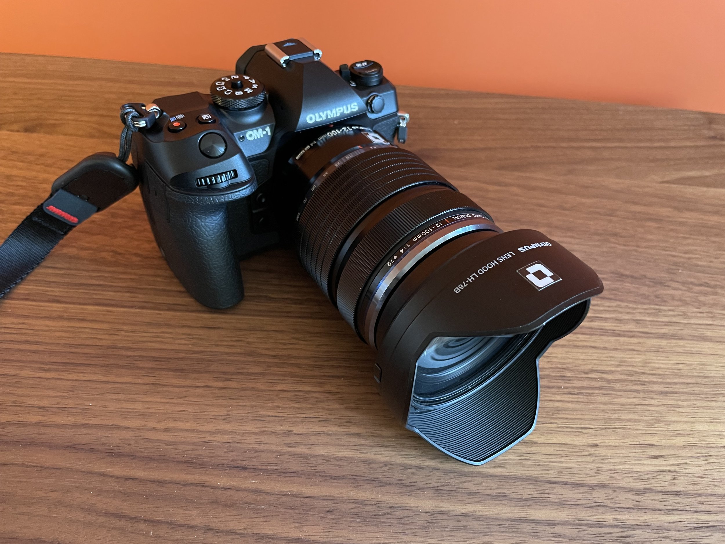
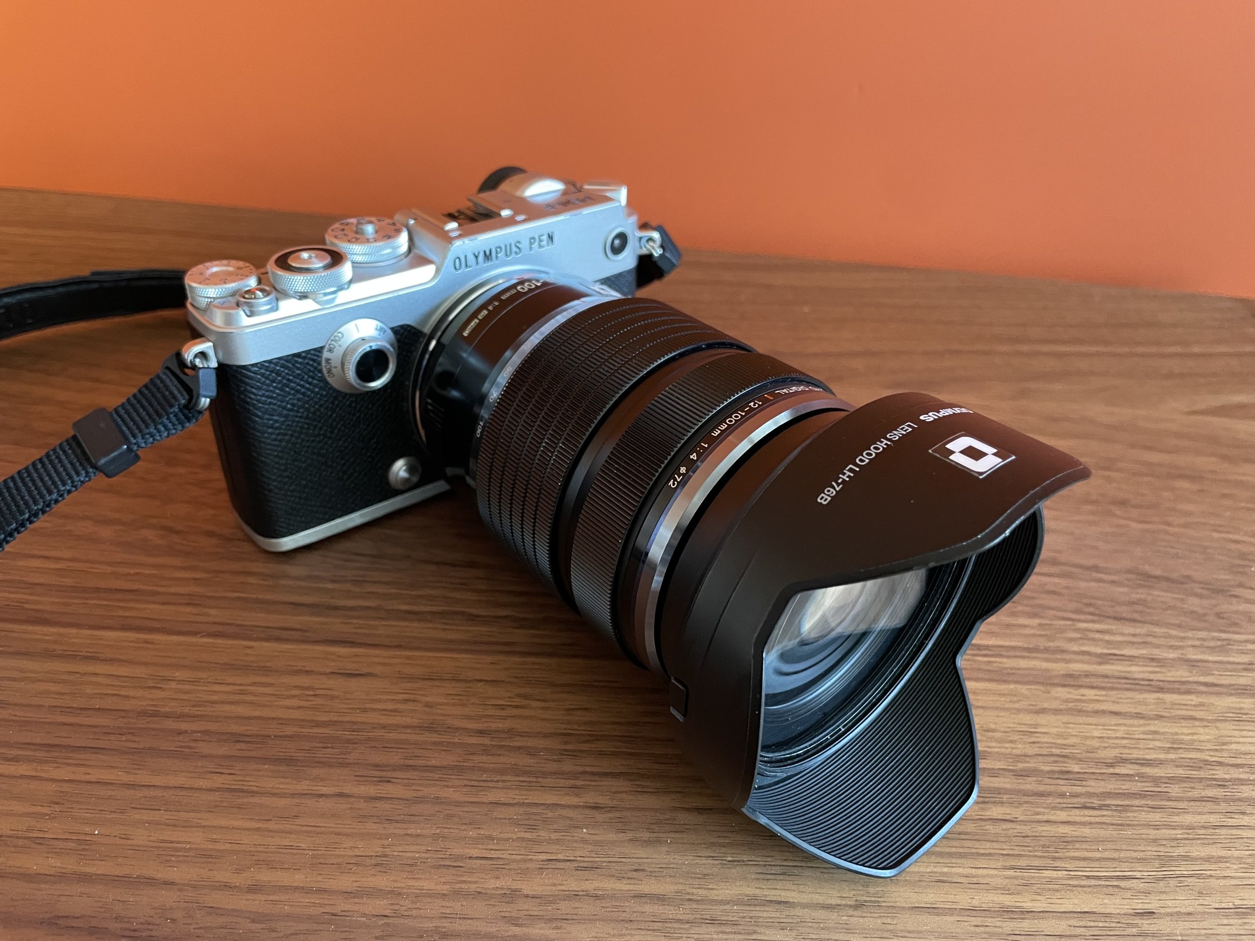
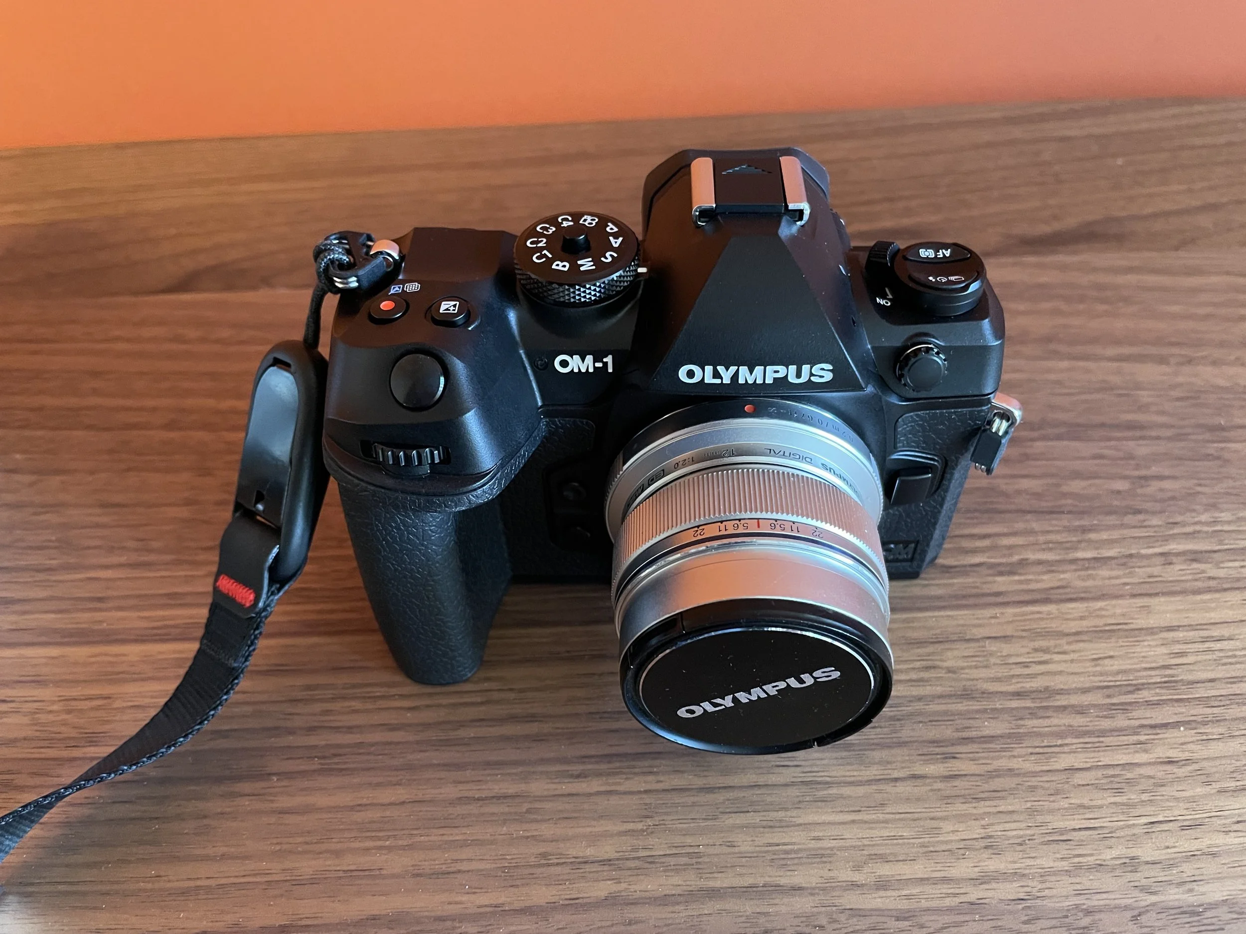
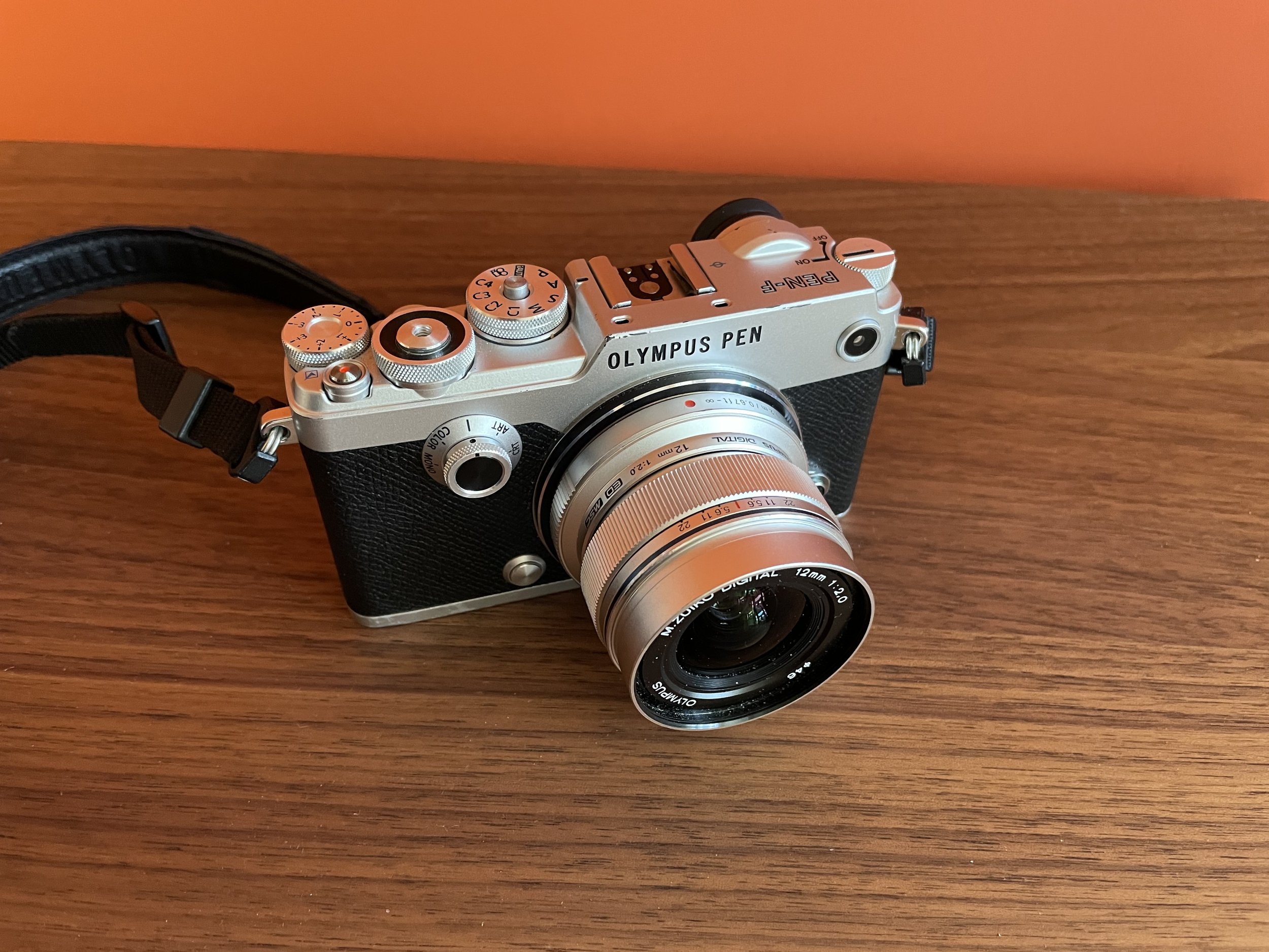
It’s also fun to compare these lenses on the bodies of my existing Pen F and the OM-1 that I rented. Below the 12-100mm on both bodies and the 12mm prime on both bodies. It gives you a good idea of the size of these. The 12-100 looks comically big on the Pen F and is not a great fit in your hand, but with the grip on the OM-1 it’s quite OK.
Going wide?
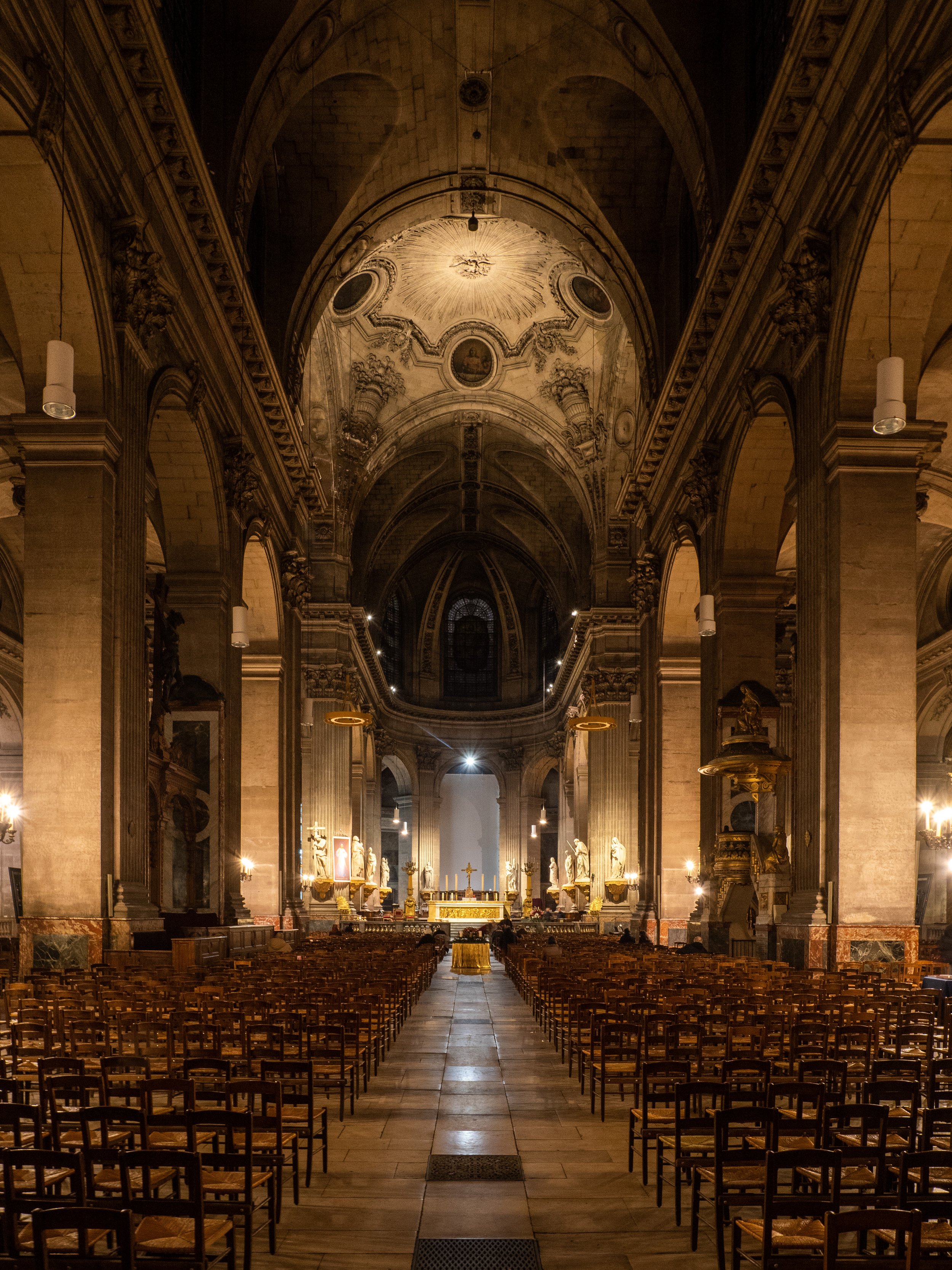
Once in Paris we walked around a lot, changed lenses a lot, and I shot a lot of pictures. Very quickly I realised that I rarely felt the need to go wider than 12mm, and 7-14mm is a really narrow range, so the 7-14mm languished a bit in my bag, to the point where I left it in the hotel room the last day because it’s als quite heavy. That day, ironically, we visited some of Paris’s beautiful old department stores where something wider than 12mm could have been useful…
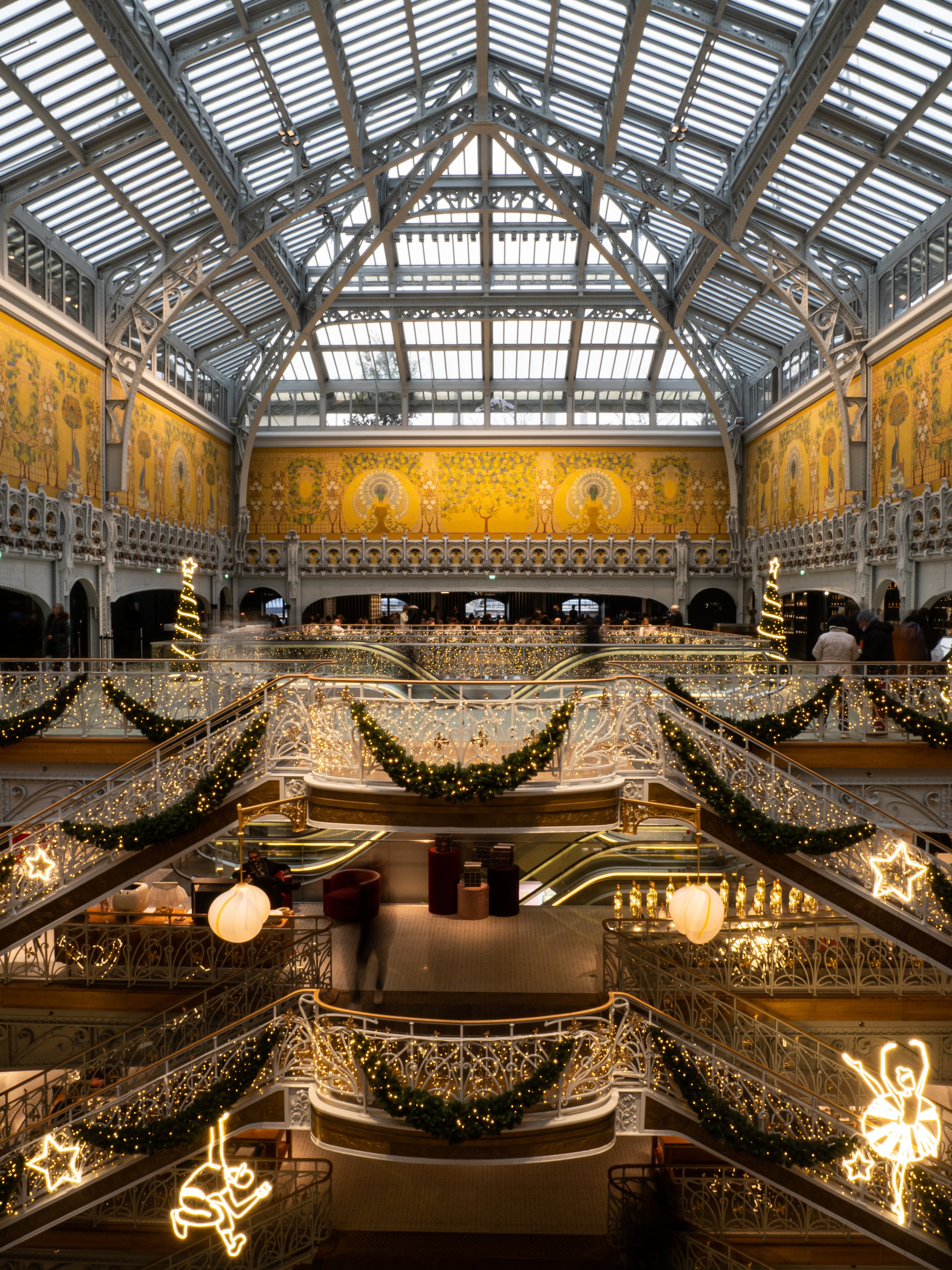
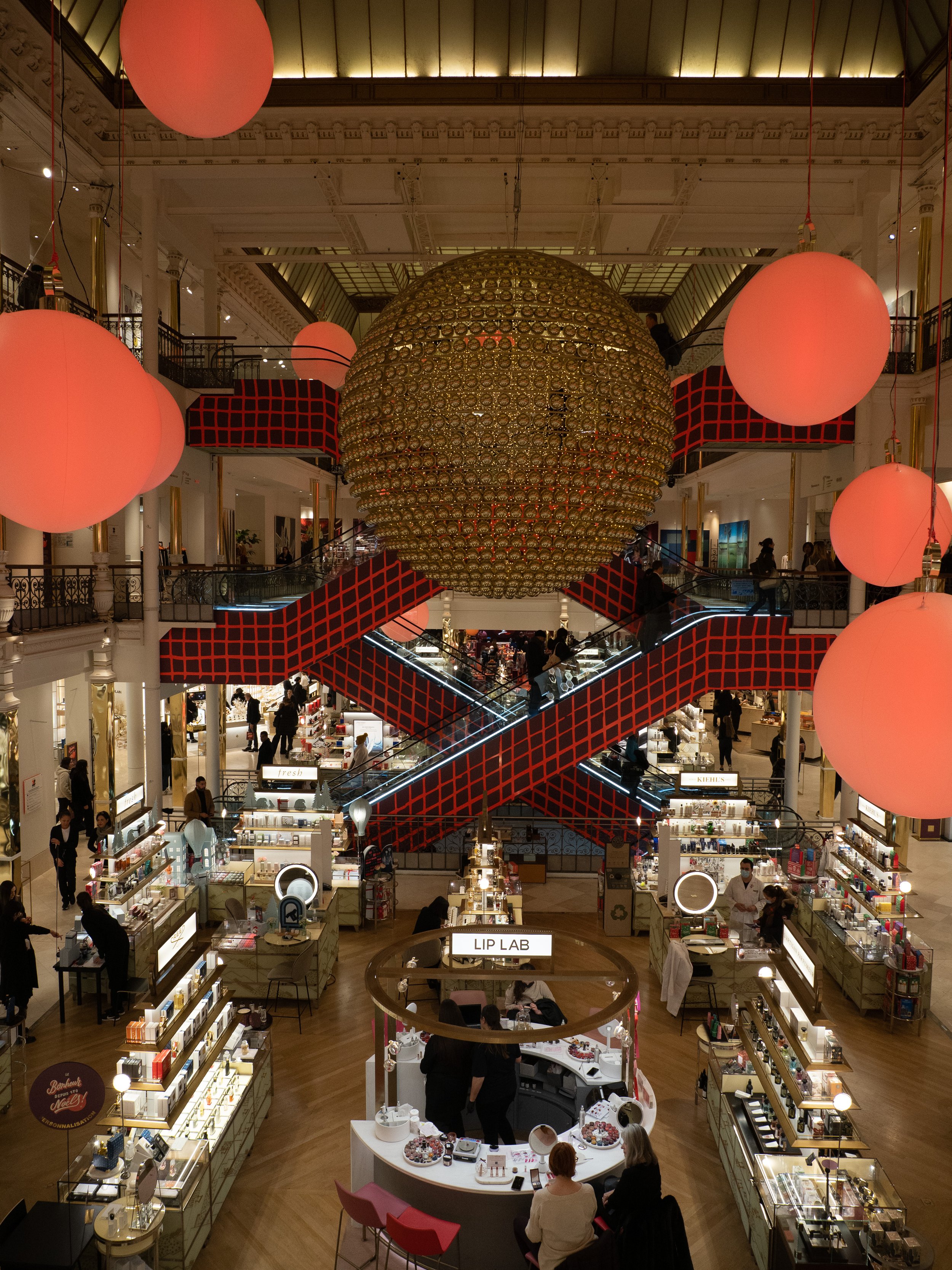
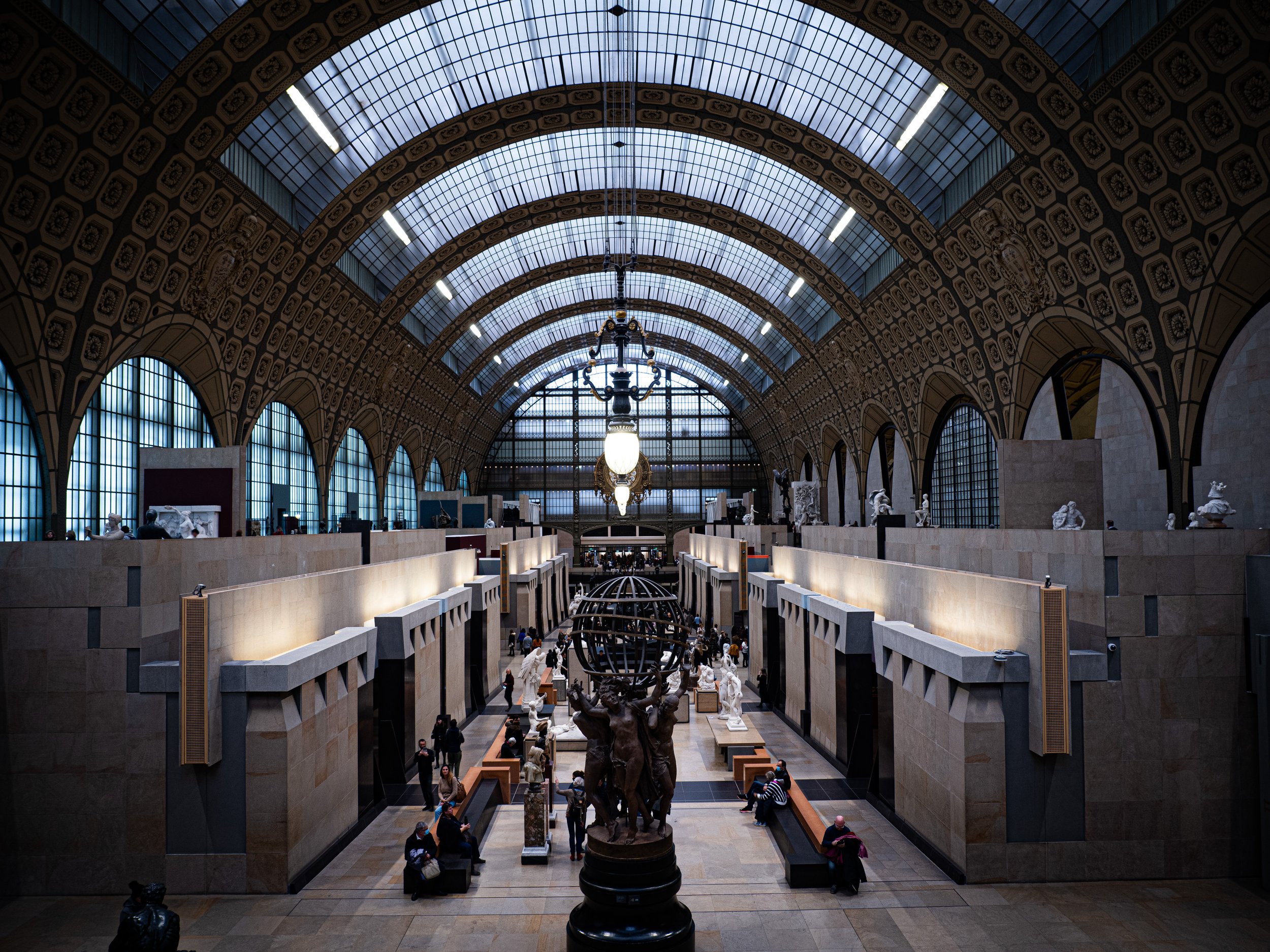
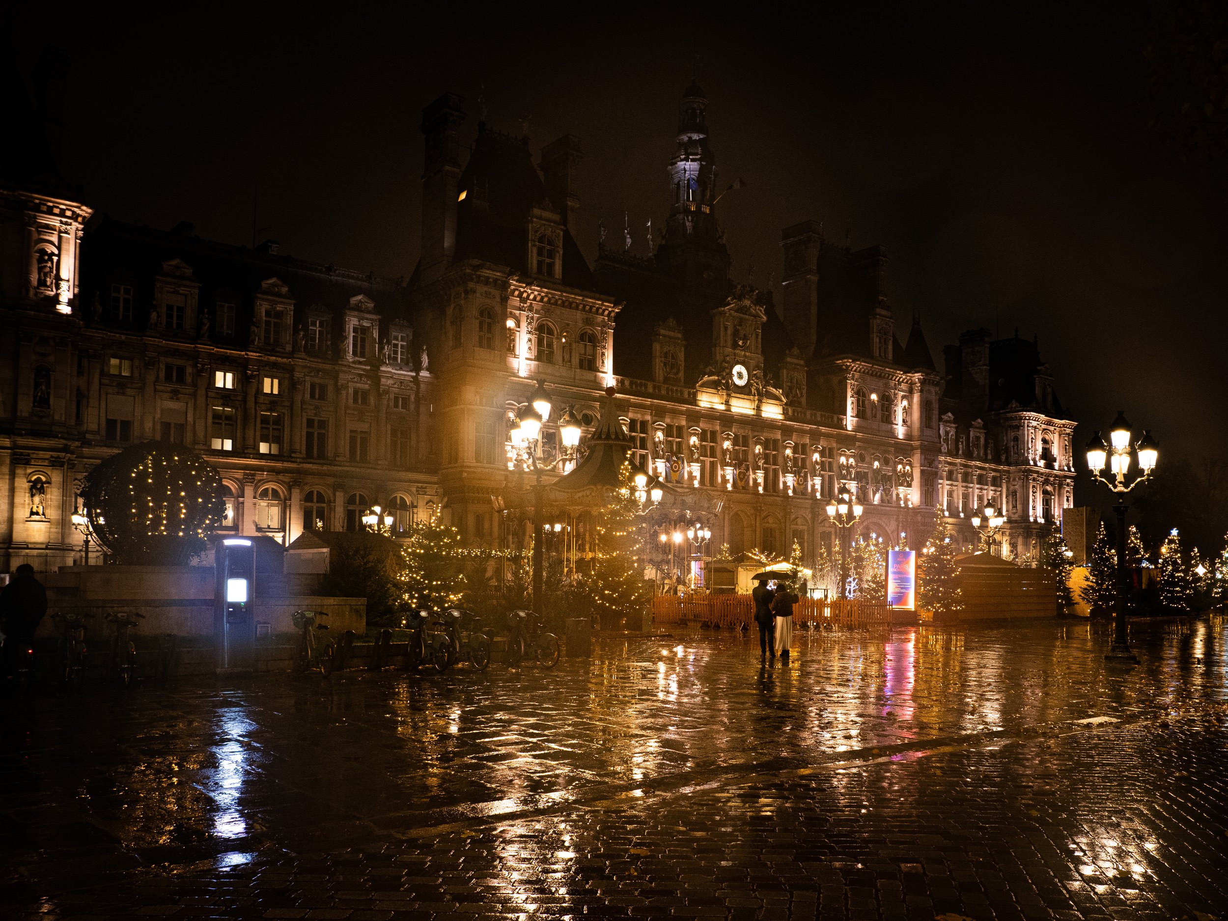
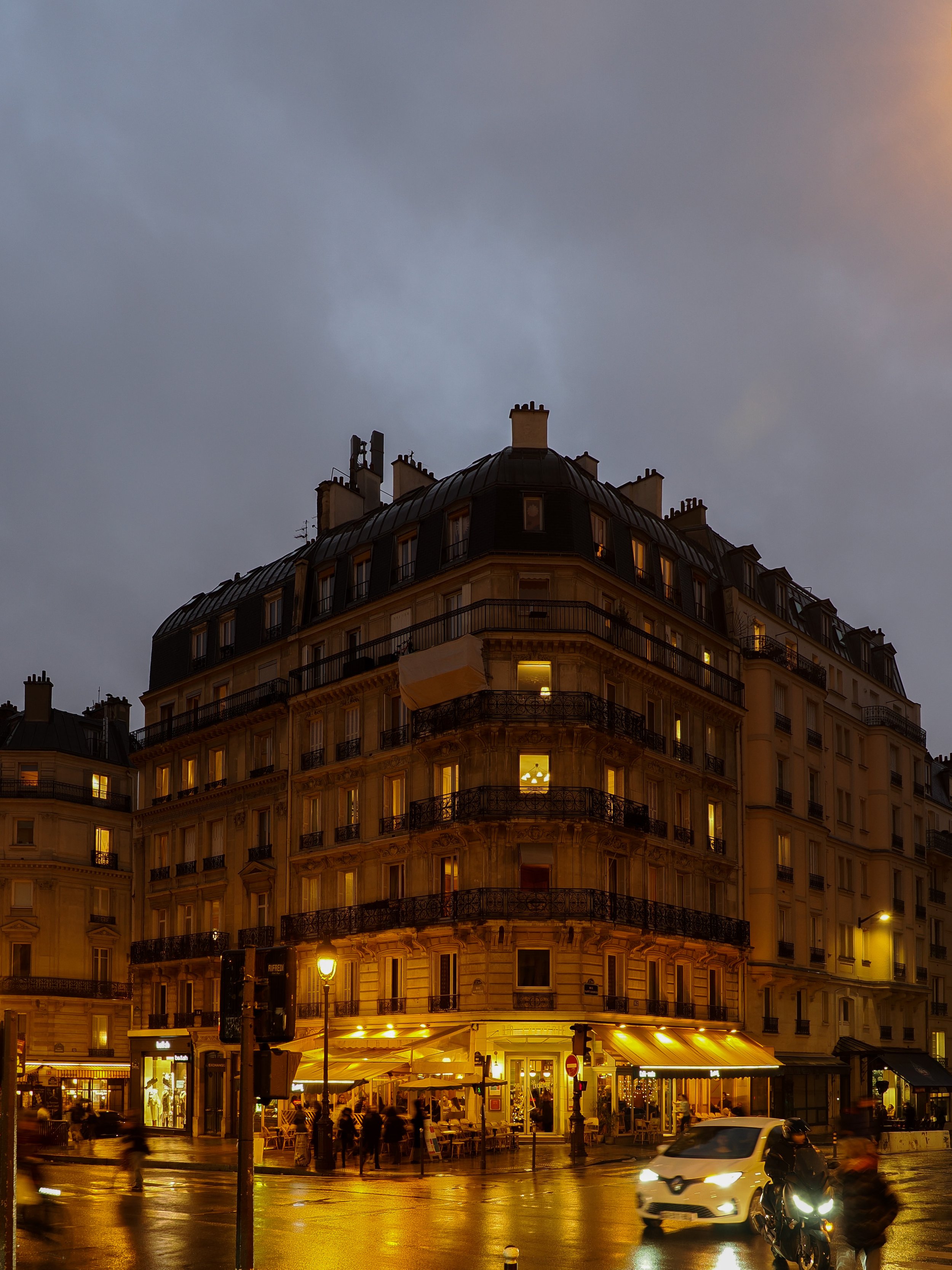
Still, the 12mm range worked well for me 90% of the time, so maybe I should look into something like the Panasonic 9mm f1.7 prime; a small one that I can always throw in my bag for those rare occasions where I want to go wider. 12mm is wide enough for a lot of what I wanted to shoot. Below’s a small gallery of the 12mm range in practice. Plenty wide in most cases:

What about the Aperture?
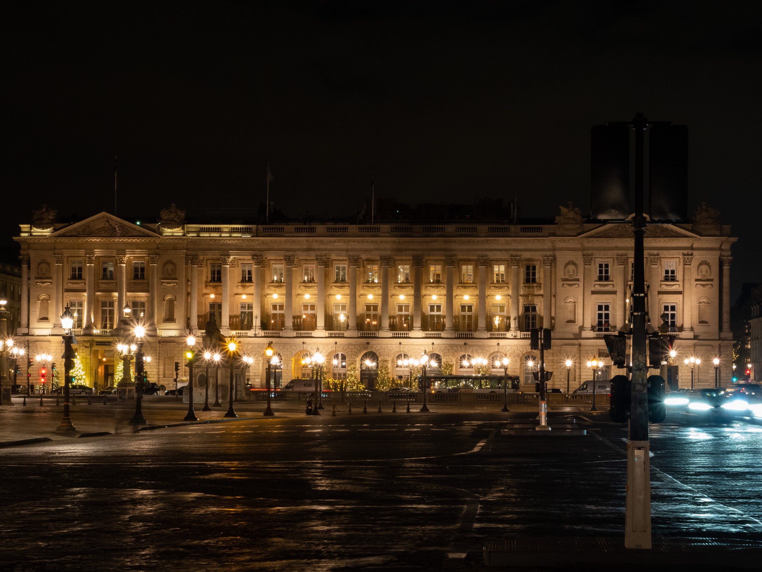
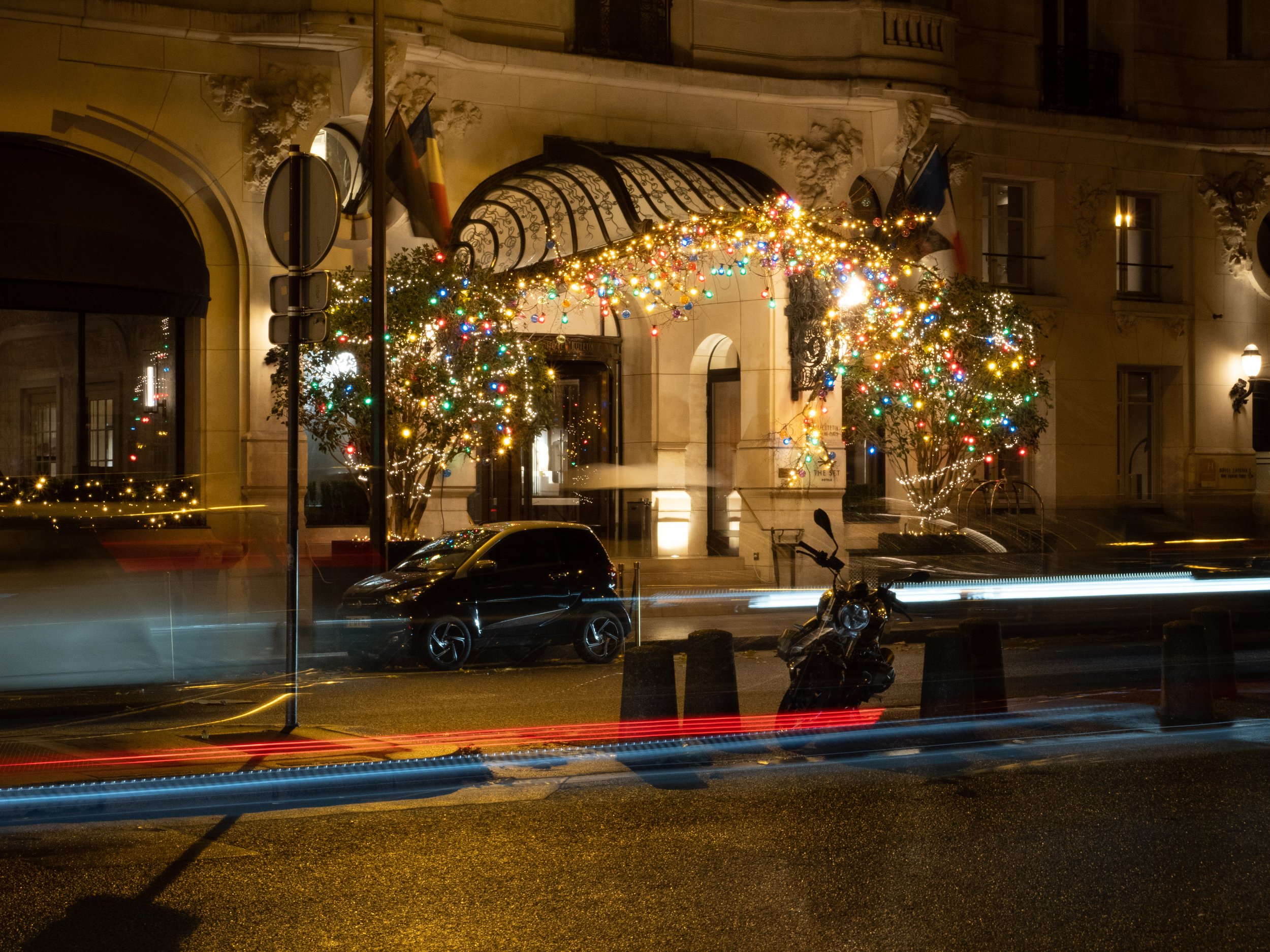
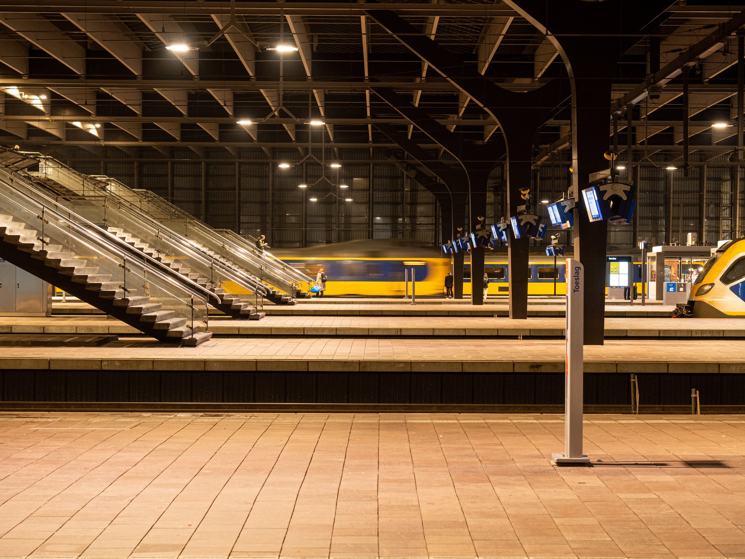
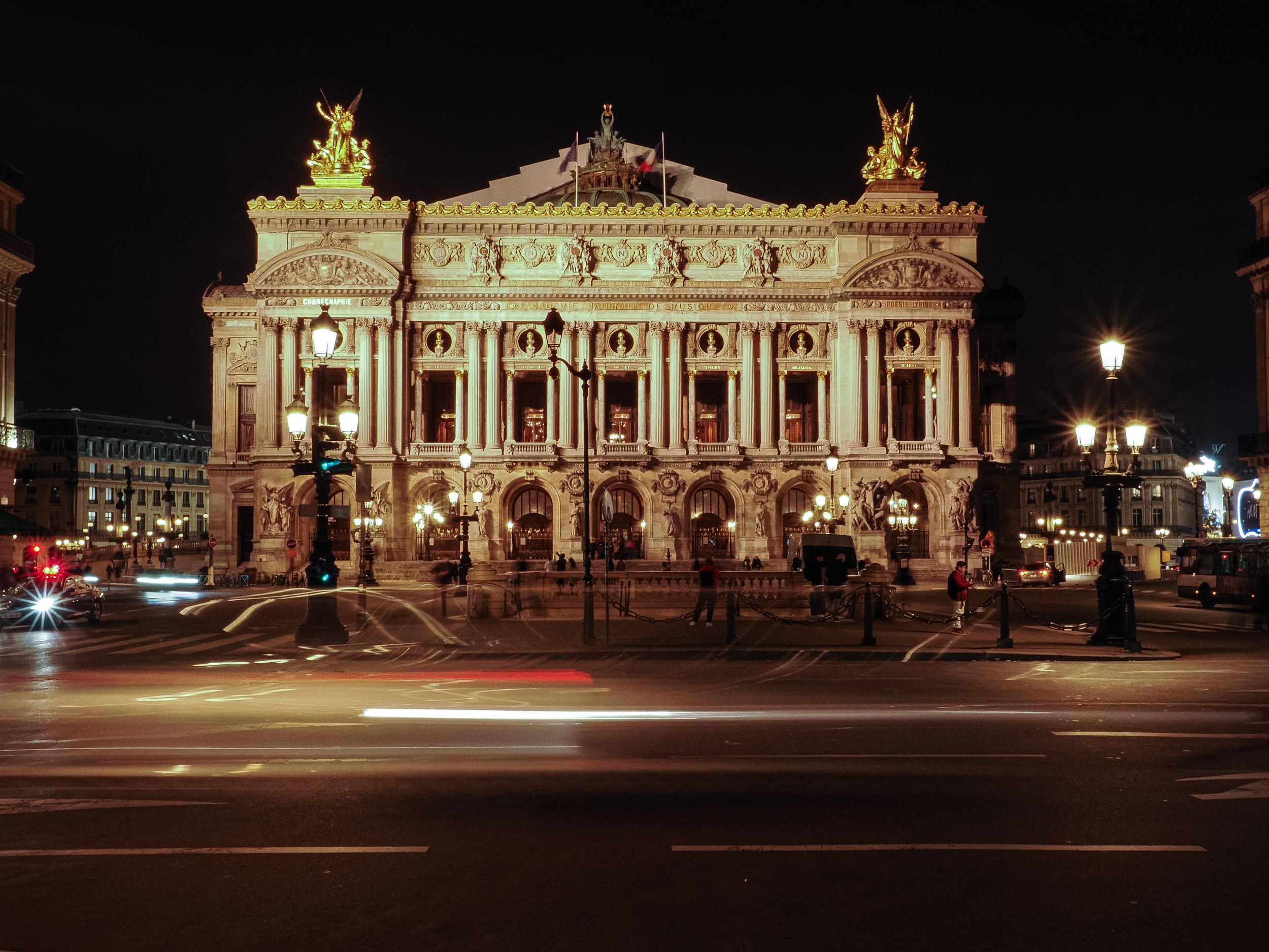
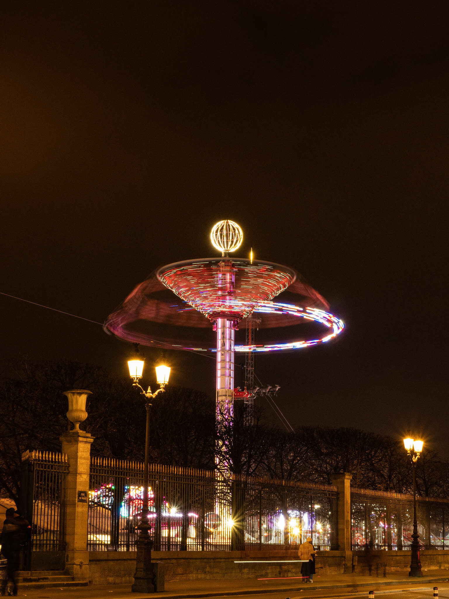
Walking around in the evening I found that I could comfortably do long exposures without a tripod, due to the excellent Image stabilisation in the OM-1’s body. I think it’s not supposed to be much better than my Pen F in theory, but the difference in practice was enormous.
I’ve done multiple 1 second exposures and never had a blurry shot. Especially when paired with the 12-100mm’s own stabilisation, the results were impressive. I found that the even the non-stabilised 12-40mm could comfortably do night shots at f4, making the lower aperture not a necessity for what I typically shoot. Again, see below for a few more long exposure shots:
Flexible range
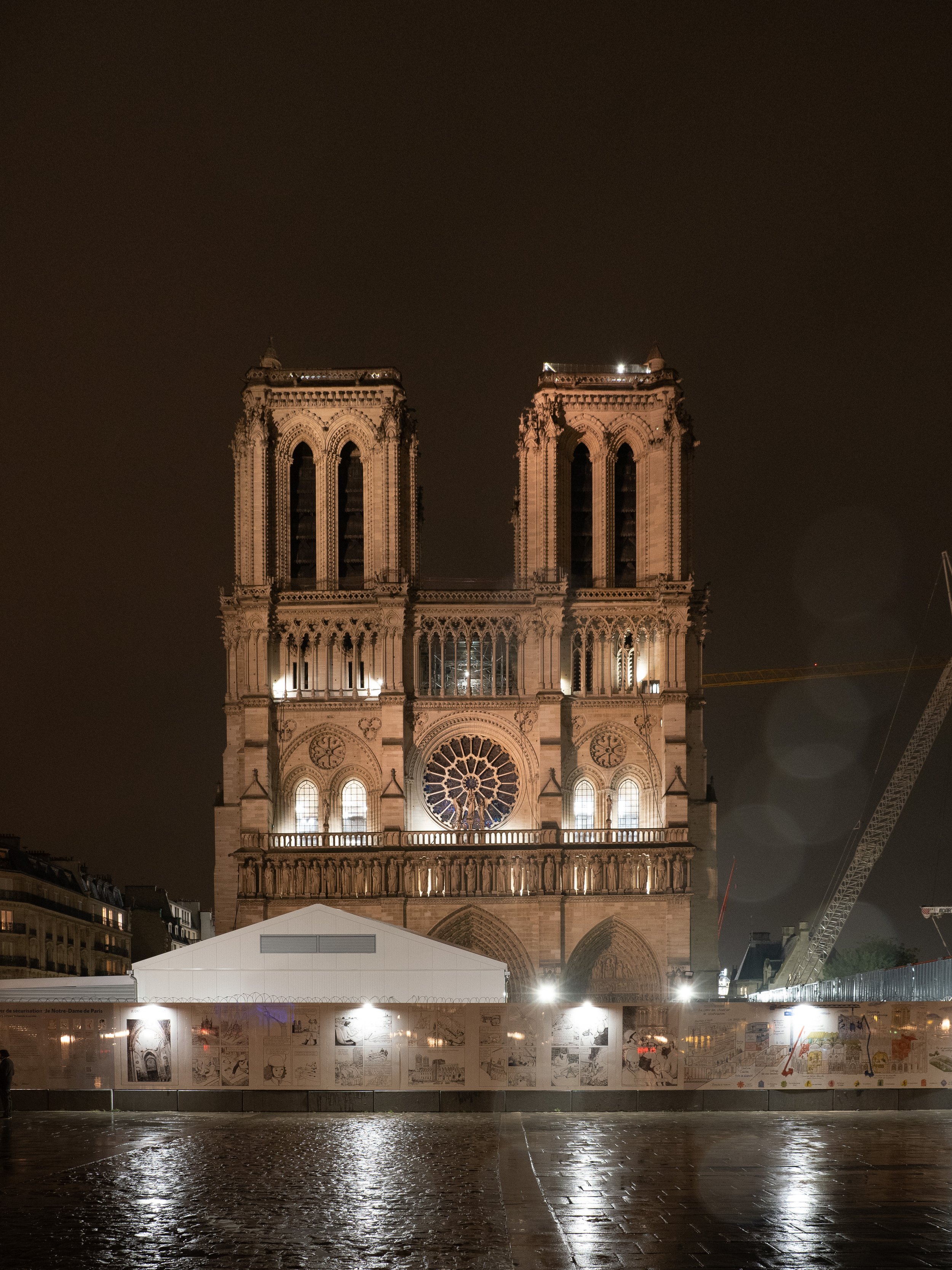
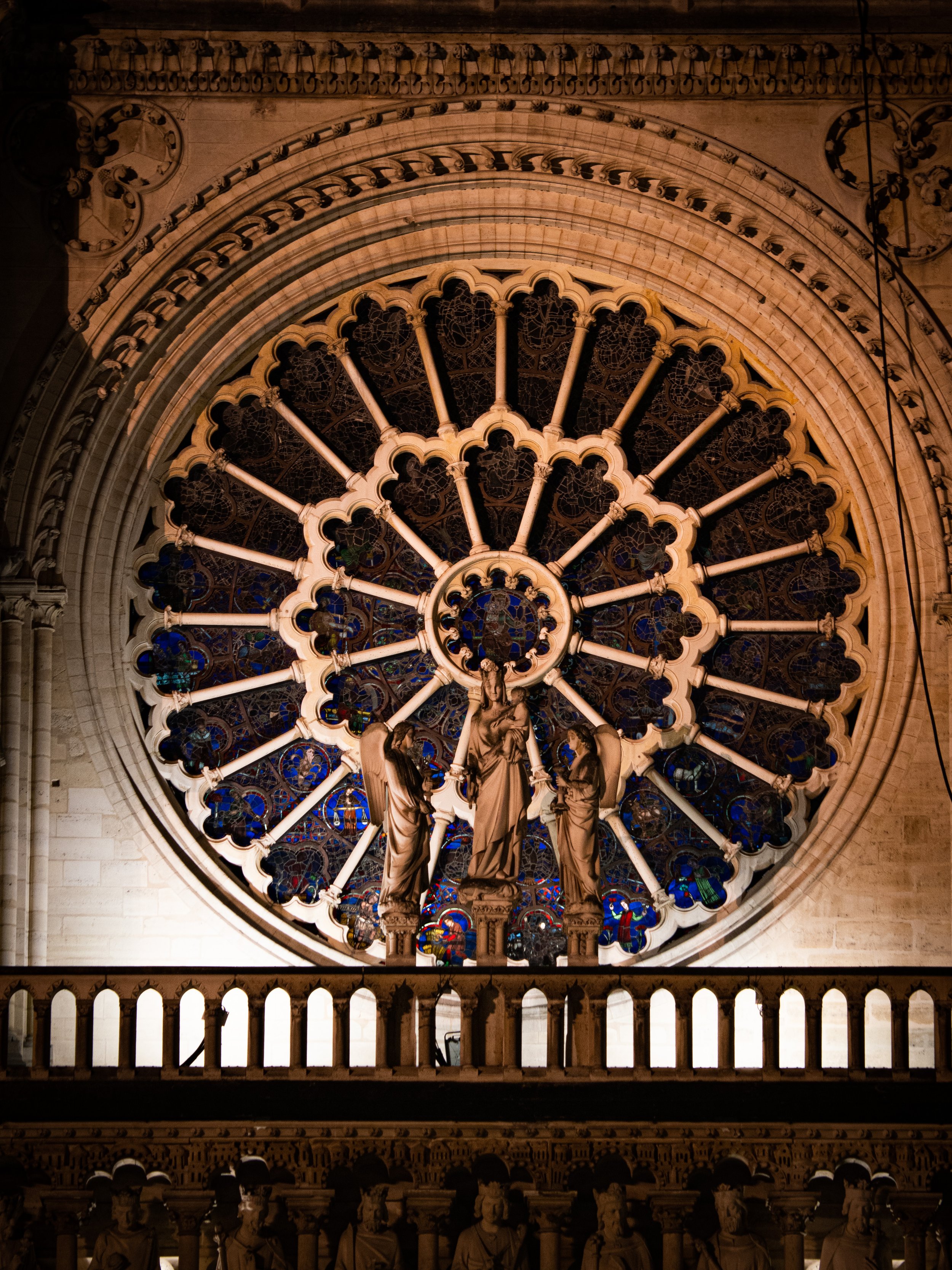
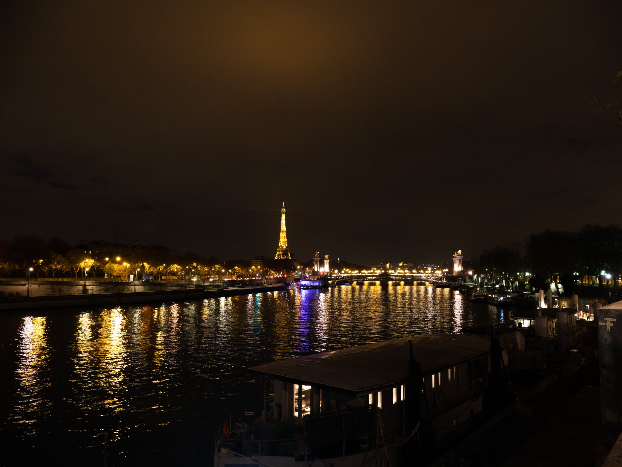
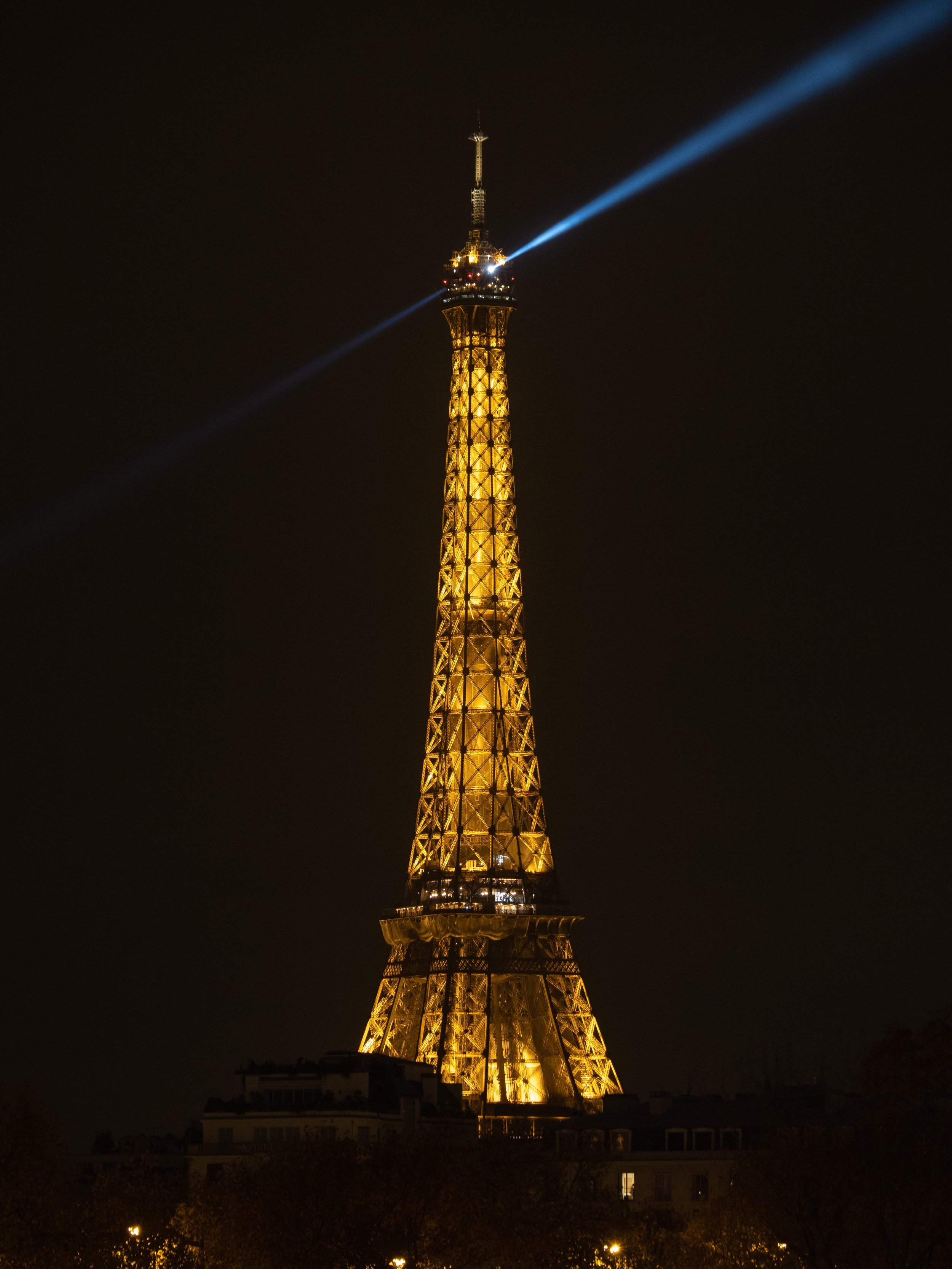
How was it walk around with zoom lenses then, not being stick at a fixed focal length? Well, the zoom range of both lenses - especially the 12-100mm was a great thing to have. To just walk around in Paris for hours without the need to change lenses at all, I absolutely loved it. To get an idea of what the 12-100mm range does (remember 24-200mm in full frame equivalent), here’s a few more photos, at 12mm and at 100mm taken from the same position. I absolutely love having that range in one lens.
Conclusion
Back at home I knew I wanted the new OM-1 body because of that great stabilisation, the lower noise levels at higher ISO than my Pen F and especially the dramatically improved viewfinder. Also I wanted that 12-100mm lens, the one lens to rule them all, which was now clear beyond a doubt.
I did also get the 12-45mm f4 lens because as a kit lens I got a good deal together with the body. Paris taught me its f4 is fine, even at night, and the importance of weight: it is quite a bit smaller and lighter than the 12-40mm f2.8. Of course, my great little prime lenses aren’t going anywhere, so I can always throw a few of those in my bag to complement the smaller zoom lens.
My only regret is that I didn’t get to test wider angles more. I may just may crack for the Panasonic 9mm f1.7 one day for that use case. Or, perhaps the Olympus 9-18 despite its dinky look, or the Olympus 8-25mm f4 because that’s such a versatile range despite its size...
Photowalk at night
For a couple of years I’ve had an Olympus PEN-F camera and have taken many pictures with it. I’ve been using Olympus cameras and lenses for many years. The first real camera I bought was an Olympus e500 and fell in love with its colors, until I dropped it and it broke.
Lately I’ve been eyeing a camera upgrade and an extra lens. What was Olympus is now OM-System and earlier this year they released a new flagship camera that I’m hoping to take for a spin soon. Still, it’s easy when eyeing new gear to forget how great the gear you already have is. Not bad for the tiny m43 sensor, I think, in these dark conditions.
Shot on a PEN-F with the new OM-System 20mm m.Zuiko Pro lens.
Mac Studio – haunted by a Trash can
The moment Apple announced the Mac Studio I knew it was for me. I want a Pro desktop machine with serious performance, some portability, and I don’t care about expansion slots. I went for the 20 core CPU option because I spend a lot of my time in Xcode, but skimped on the GPU because there’s no tasks that I do that really tax it. I’ve been running this machine for a couple of months now and thought I’d write about it.
I’m fascinated by the Mac Studio. Not because it’s fast (it is, and that’s all I’ll say about it), but because it tells us so much about what Apple is today and how they have changed. It’s is a fascinating contrast to a similar, yet very different to a Mac Apple created a decade ago; the infamous “can’t innovate anymore, my ass” trash can Mac Pro, released in 2013. Both are compact pro machines which lack expandability, but beyond that they’re almost a study in opposites.
The trash can Mac Pro came at the beginning of a problematic area in Apple hardware design – from its negligence of Pro machines to the Touch Bar and the butterfly keyboard debacle. The Mac Studio rounds off of a solid reversal of said period, with Macs universally heralded as great, solid, fast, quiet computers with, in case of laptops, fabulous battery life. A reversal started with the M1 Macs that culminated in their fastest, most powerful chip yet, the M1 Ultra, only available in the Mac Studio.
With that Mac Pro, Apple seemed more interested its design than anything else; its sleek cylindrical shape and the machine’s clever cooling, than in serving Pro users’ needs. Mac Studio is the opposite; its design is utilitarian. It doesn’t even try to look like an object of art. Instead, it’s just a tall Mac mini, and there’s something charming in Mac Studio’s clunkiness – it’s solid, heavy and its unashamedly a machine for serious work. A square box with plain ventilation holes in the back and ports (ports!) on the front of the machine. There’s a time and a place for pretty, thin gorgeous machines and this Mac proudly isn’t one of them.
The trash can Mac Pro had a clever chimney-inspired ventilation system that couldn’t power the dedicated graphic cards of its day whereas the Mac Studio has only integrated (but impressive) graphics, a massive heatsink and two big boring fans. The Mac Pro ‘innovated’ in its shape, its design, its cooling. With Mac Studio, Apple innovated in chip design instead, making its biggest, most powerful chip yet.
In fact the trash can Mac Pro still casts its long shadow to today, haunting Mac Studio from beyond the grave if you will. During a rare moment of mea culpa at Apple, Craig Federighi admitted they painted themselves in a bit of a thermal corner with that cylindrical chimney design and I can only suspect they swore a solemn vow internally to never ever be in that situation again. It must have been a traumatising experience. Why do I say that? Mac Studio has a really good ventilation system: the machine remains cool no matter what you throw at it. In fact, its fans never spin up it seems and, unfortunately, never spin down either, which brings me to its one huge downside…
The Mac Studio’s fan is always on, at 1600 rpm, and I can hear that. I really can hear that fan quite clearly. In fact, I almost returned the machine until I discovered a very useful little utility: Mac Fans Control. With it, I can manually slow the fans down to 1100 rpm, which is quiet enough for me. And since my heavy CPU usage is always in short bursts, I trust my CPU won’t melt. Even in its failings, the Mac Studio is an interesting machine…
The last intriguing question this Mac Studio poses is; what room is there for a Mac Pro? Is the M1 Ultra really only shipping in one version of the Mac Studio? Is that really worth it to Apple? How many M2’s Ultra’s can they daisy-chain together for a Mac Pro? Who needs that power and is willing to pay that Premium? For all my love of Pro machines, I really do wonder if there’s room for a Mac Studio and a Mac Pro. Also, I think the area of third party graphic cards is over, which also makes you wonder what extensibility means; how much hard drive expansion slots do you really need to justify the old Mac Pro design? Anyway, that’s a story for another post. As I said, it’s a fascinating little machine.
After Steve
I recently finished the book After Steve, by Tripp Mickle. Briefly told, the book follows Job’s left- and right hands, Tim Cook and Jony Ive in alternating chapters through their time before Apple, their collaboration with Steve Jobs and how each found their path after his death: Stoic operations expert Tim Cook continuing to do what he does best, leading Apple to greater-than-ever financial heights, and Job’s other lieutenant, Jony Ive who, through a combination of grief, getting burned-out, and sidelined lost his touch and left Apple.
The book also talks of a company that has forgotten how to innovate. Its subtitle leaves little to the imagination: “How Apple Became a Trillion-Dollar Company and Lost Its Soul”. I’m not sure I agree with that premise, but I’ll get back to that later. Still, I enjoyed reading the book and if you have an interest in Apple I think you’ll find it interesting too, despite its flaws.
More than reading about the specific people involved, I’m always interested in reading about how some of my favourite products came to be. Because of my background at Sketch, I often think about ‘Product’, as a role within a team, and where it sits between Technology and Design; someone who is the decision maker who sits on the crossroad of what is possible, vs what is desirable, and what is achievable in the time constraints we have. That is what I call the ‘Product’ role at a company – a role distinct from Design, and it’s the lens through which I read this book.
A Product role executed well lets each part shine; Engineering, Marketing and Design come together to build a great product. Like here, with the iPod:
To run the project, Jobs hired Tony Fadell, a hardware engineer who had worked on General Magic's personal digital assistant. Rubinstein and Fadell assembled the components, while Apple's head of marketing, Phil Schiller, contributed the idea of creating a wheel to scroll through songs, a concept inspired by a Bang & Olufsen phone. They handed the ingredients to Ive to package.
That last sentence sounds ominous though. And indeed, a little later:
Despite the triumph, Ive was disappointed. His design team had been less central to the product's development than it had been to the iMac. He wanted a bigger voice in conceptualizing what Apple made.
Indeed, to do design well, designers shouldn’t come in at the end and be given a box while being told to “make it look good”. The idea of the click wheel, a singularly great way to browse through a collection of a 1000 songs, that is great Design. It’s not how it looks, it’s how it works, to quote another cliché. While the result was arguably great, we can also understand Ive’s dissatisfaction here.
With the development of the iPhone, it seems that everything came together beautifully. Design had a big hand in shaping the final look and feel of the phone, and was instrumental in some of its core technologies. At the same time, the software and hardware marched ahead at lightning speed and the entire project was guided by clear purpose and direction – it’s a story of absolute triumph.
Things can also tilt in the other extreme, where Design, unchecked by reality, takes off into the stratosphere, conceptualising products that cannot be built – the software-complexities of the Car project in this case seemingly waved aside:
Outside, an actor performed as Siri and read from a script that had been written for the fanciful demonstration. As the imaginary car sped forward, Ive pretended to peer out its window.
"Hey, Siri, what was that restaurant we just passed?' he asked.
The actor outside responded. A few other exchanges with the executives followed.
Afterward, Ive exited the car with a look of satisfaction upon his face as if the future was even grander than he'd imagined. He seemed oblivious to the engineers looking on, some of whom were gripped by a worried feeling that the project was as fictional as the demonstration, moving fast but nowhere near its final destination.
Software is hard – and very different from hardware! The best products are built when the impossible is just far enough ahead to be within grasp of what’s possible – like with the iPhone, and seemingly unlike the Car project. It’s when design and engineering come together, guided by a combination of teamwork, taste, realism and ambition. This is to me where a Product person should sit, which Steve Jobs at Apple did singularly well, and which for Apple, after his death, is a void impossible to fill.
After Jobs’s death, we read about Design becoming more insular, of Operations-minded people filling up the Board, and of a slowly developing gulf between Design and Operations. As an example, one did not talk about the cost of things in the design studio – an understandable encouragement to think freely and come up with revolutionary new ideas. Yet, in the end, products need to be created for a price a consumer is willing to part with, and the inevitable clashes began:
More and more engineers and operations staff filtered into the studio to manage all the elements of the watch and a push by Apple's product marketing arm to diversify the iPhone with a lower-priced model in five colors. The newcomers brought Cook's back-office concerns about operations and costs into the sacrosanct studio. Ive's unwritten rules began to be broken.
The frustrations on either end are understandable. The balancing Product person chief was missing, leaving one side unchecked and the other out of the loop. Now that Ive has left Apple, Design reports to Jeff Williams. It seems that the pendulum has swung back. The book finishes with this ominous paragraph:
Late that afternoon, after the stock market closed, Apple issued a press release announcing Ive's departure. The release outlined a new reporting structure. After fifteen years of reporting directly to the CEO, Ive's old design team – the group of aesthetes once thought of as gods inside Apple – would report to Apple's chief operating officer, Jeff Williams, a mechanical engineer with an MBA.
It does not leave the reader with a great feeling: a company whose great innovations are behind it, a shackled design team and a CEO who’s content to coast on service revenues. I don’t share that pessimism though. The recent technical innovations around the M1 chips, and the great hardware designs around it have left me more excited than ever in fact.
And what’s more, I don’t think Design should reign supreme. It is tremendously important, of course, but there needs to be a balance between things. For all the brilliance of the two men, Cook and Ive, they needed an editor, a Product Director. If anything is missing on Apple’s leadership page, it may be that role. It may just be that those shoes are too big to ever fill.
A place to call my own
I’d like to have a place to call my own.
I take the occasional picture I’m happy with but I don’t want to entrust it to a company like Facebook Meta, who treat my content as their own and will repeatedly jank away the carpet from under my feet to experiment with new formats to promote engagement.
I don’t share photos to gather likes and build an audience. There are pictures, words, my musings, and if you like them, that’s fine. If I don’t appear in your doom-scrolling twitter feed or never-ending stories or photo stream, that’s fine with me as well.
Things were nicer on the internet when people still had their own website and not everything was a game to gather as many likes and subscribes as possible. This place doesn’t have any of that, and I’d like to call it my own.
Exploring Brittany
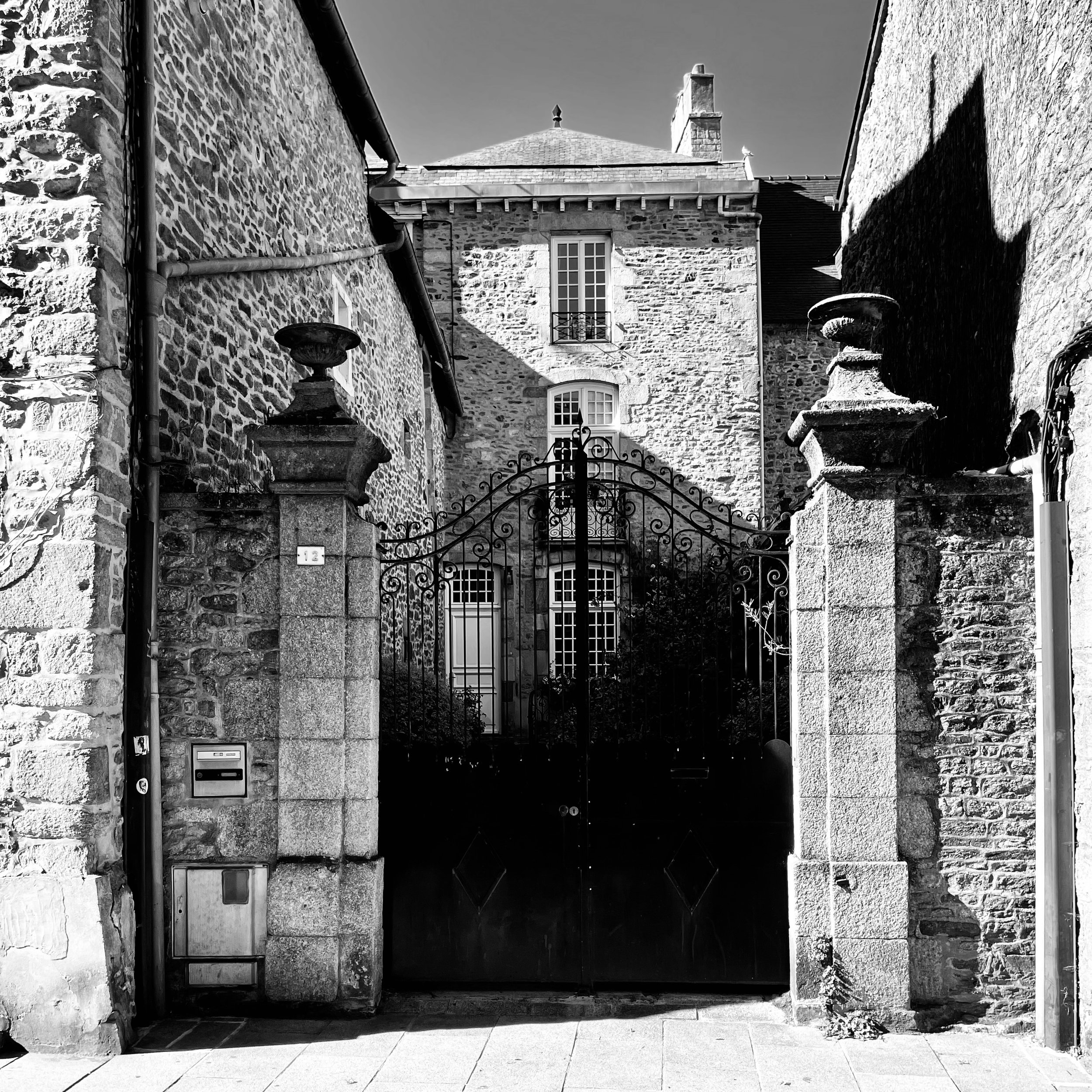
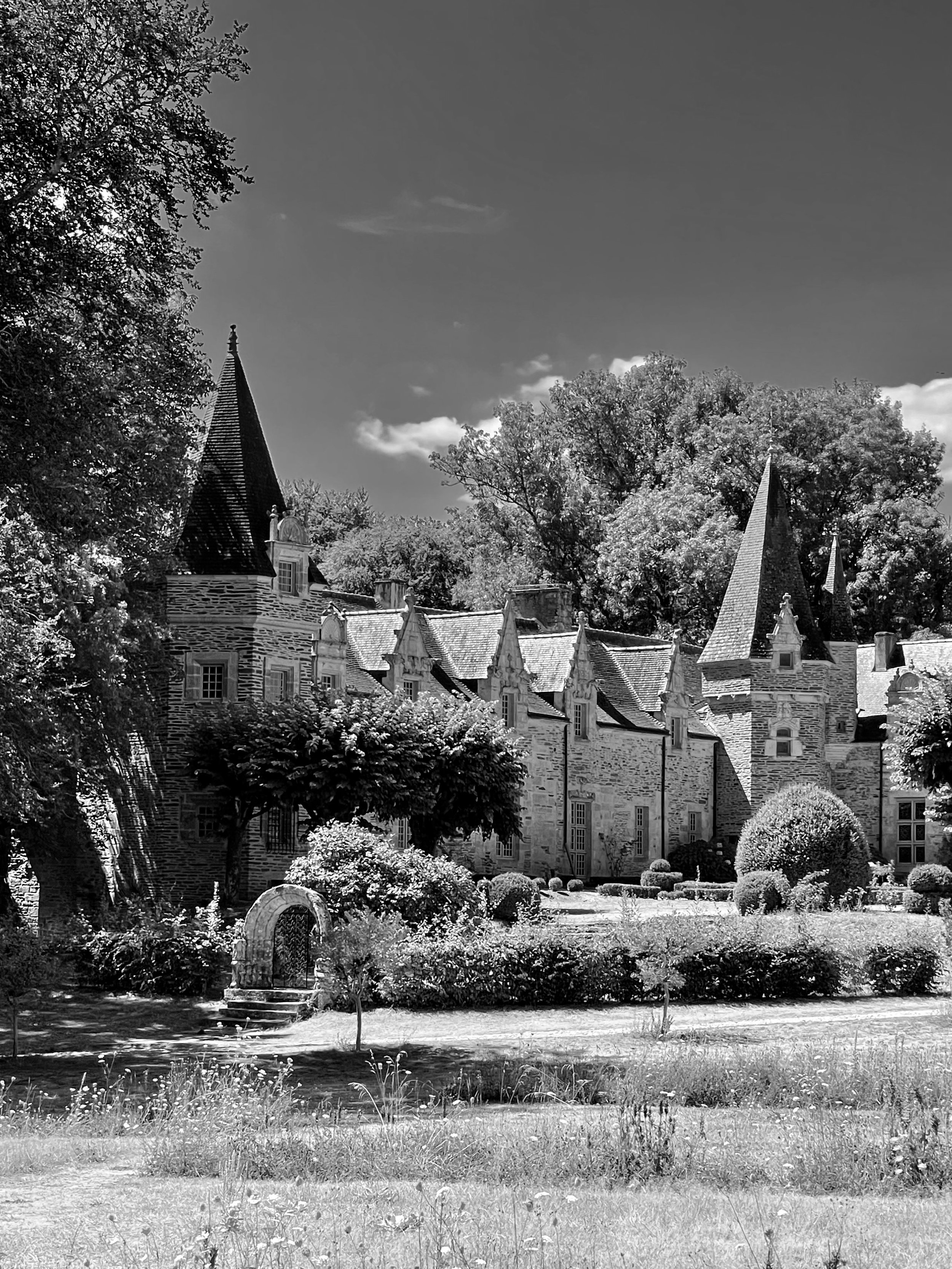
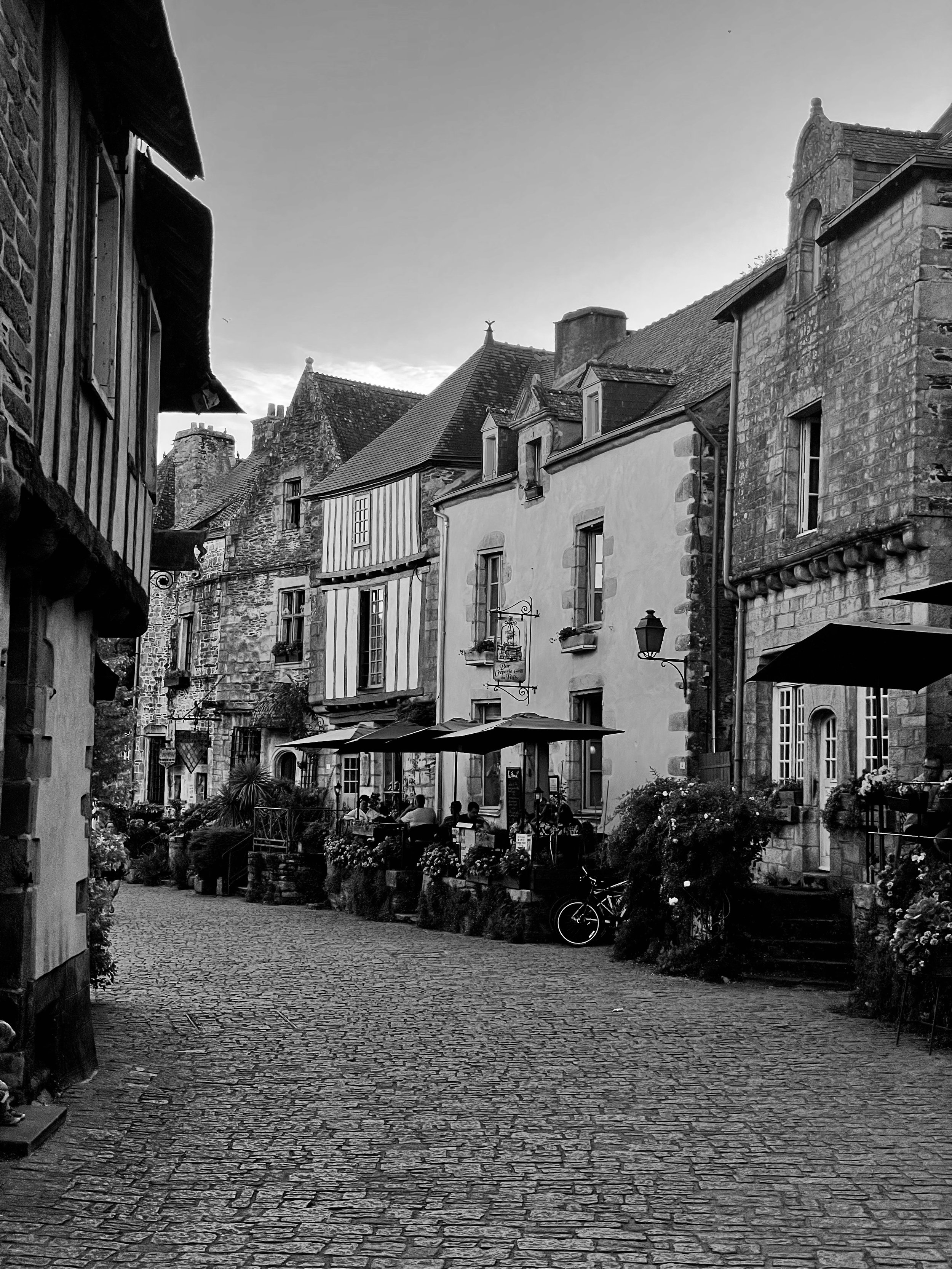
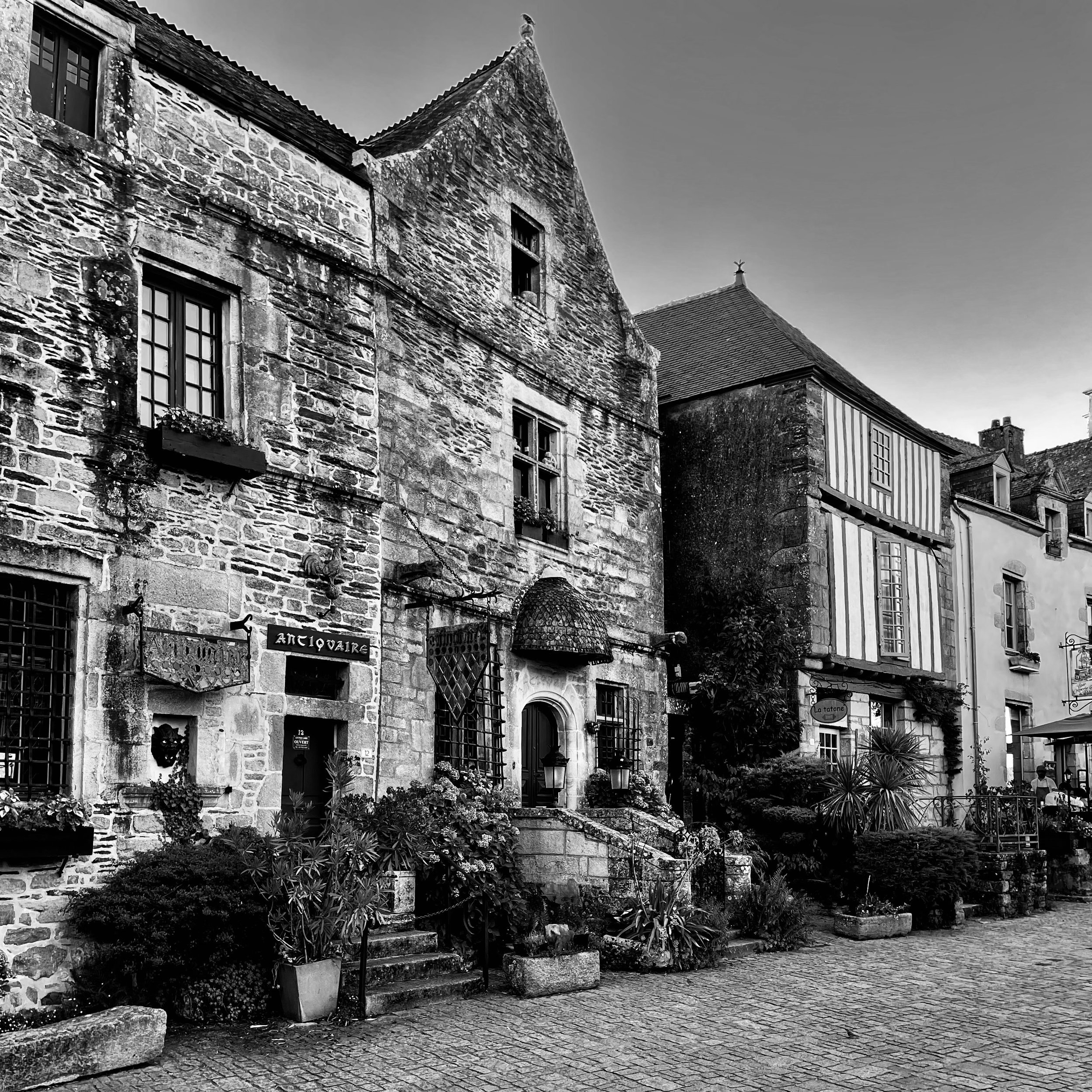
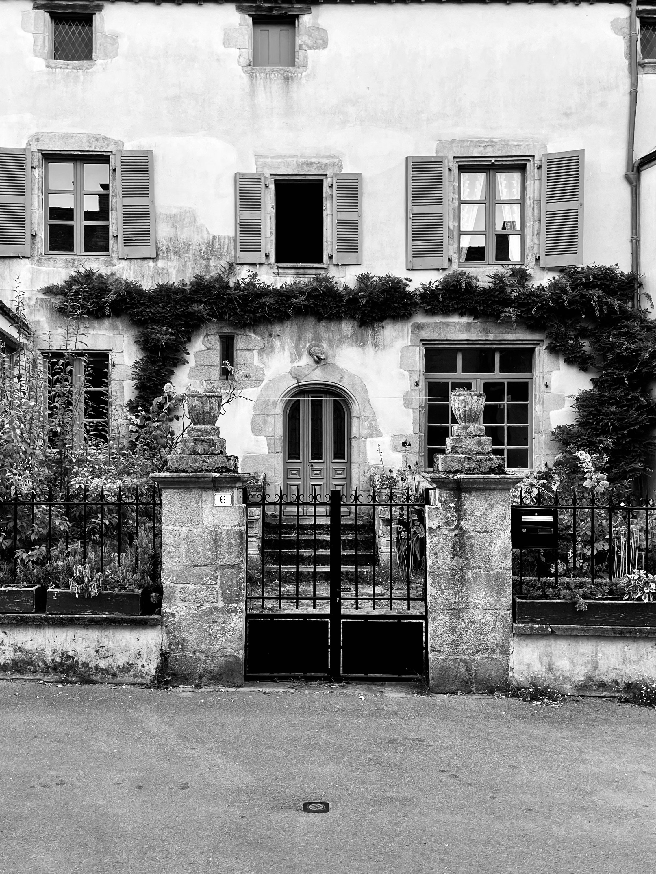
We spent a few weekends exploring some lovely old villages in Brittany, France. Avoid the busy season or come late in the evening to best enjoy them. Pictures above taken from Rochefort-en-Terre and Dinan.


